Blog | Ecommerce | Mobile App
30 Best Ecommerce Apps Examples
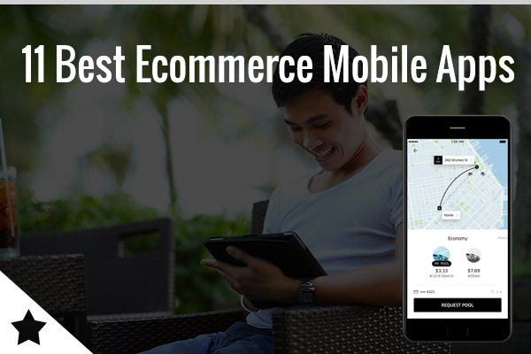
Mobile ecommerce has made online shopping accessible to anyone with a smartphone and internet connection.
Mobile ecommerce has made online shopping accessible to anyone with a smartphone and internet connection.

Want to turn your sketches, paintings, or digital illustrations into cash without stocking inventory? You can. The best print‑on‑demand sites for artists handle printing, shipping, and customer service while you focus on creating. You upload your art. A customer orders a tee, poster, or mug. The POD site makes it and ships it. You collect…

If you run ads, build funnels, or just need pages that convert, you’ve probably heard the Unbounce vs Webflow debate. Both are powerful. But they solve very different problems. This post will show you exactly where Unbounce wins, where Webflow dominates, and how smart teams use both. Let’s get into it. Who Is Unbounce Built…

Still using Campaign Monitor for your emails? You’re not alone. It’s clean, reliable, and makes campaigns look polished. But when your list grows, you pay more. And when you need real automation, SMS, or ecommerce triggers, you start hitting walls. If you’ve been thinking about switching from Campaign Monitor to cheaper email platforms with stronger…

If you love Vipon but you’re hitting dead ends on deals or want more options, you’re in the right place. Amazon shoppers and sellers both use Vipon alternatives for Amazon deals and coupons to score 50% to 99% off or to kickstart product reviews. The trick is knowing which sites are legit, which ones fit your style,…

7 out of 10 Shopify stores that hit 6-figures in their first year are running print on demand. No warehouse. No inventory risk. No “sorry, we’re sold out” emails at 2AM. Print on demand on Shopify is blowing up because it’s the only eCommerce model where you can launch a full clothing brand, home decor…

You spend hours writing content, but Google sends you 12 clicks. The problem is not your writing. It’s your keywords. Pick the wrong ones and you stay invisible. Pick the right ones and traffic shows up. That’s why you’re looking at KWFinder vs Semrush. Both promise better keyword data. But they work differently, cost differently,…