When it comes to bragging about your team, you want to make the best impression possible so that people feel comfortable doing business with you.
It’s important that consumers and potential clients know who is “behind the mask” because people like dealing with people, not companies and brands.
Having awesome meet the team pages breathes life into your company and builds trust and confidence among your audience.
So with that said, today I wanted to share with you 21 of the best meet the team pages that you can potentially use for your website.
1. Amazee Labs
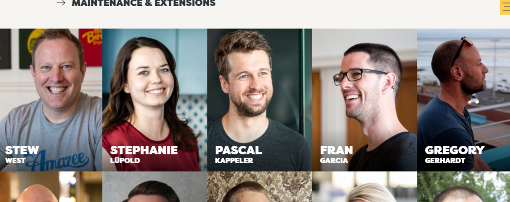
Amazee Labs has a superb our team page that truly highlights not only their team members but their design capabilities.
For each individual, their image is over-laid by their name in white, and when you hover over their name, you will notice that their position in the company appears.
The team page equally shows the hyperlinks that group various team members, ranging from floor members (everyone) to various levels of hierarchy in the company.
The writing on the team page isn’t much, but it’s still very clear and concise to any visitor.
Their ‘about us’ page is contained in a hyperlink to the mid-right of the first image on the home page and a ‘contact us’ button to the mid-left of the same image.
On the top right of the page is an icon that looks like a menu button, which switches the home page to a summary page showing all the links to their services, descriptions, and even their contacts.
2. Electric Pulp
Electric Pulp is a classic company that uses black and white to create a vintage look for their website’s about us page. They help to bring on-screen projects to life with their creative artistic talent.
The amazing thing about this ‘about us’ page is that every image is associated with an ‘animated gif’ (which is, of course, the best fun of the team member concerned), and which you can watch by simply hovering your mouse over the image.
The company team page contains all of the information you need to know about the company and their services, outlined with numbers ranging from one to eight.
Another interesting thing about the architecture of this website is the links and hyperlinks on this page that permit any visitor to migrate from the home page to other pages for detailed information about the company and their services.
These links and hyperlinks are designed both as words and as box images, which all get highlighted as you scroll your mouse wheel over them.
Finally, this home page is so engaging to its visitors in that it makes provisions for you to be able to contact them via their email, social media platforms, landlines, and you can even write to them directly from this page.
3. Rock Kitchen Harris
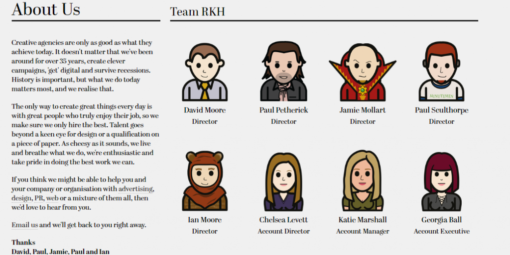
Rock Kitchen Harris has one of the more fun our team page designs that we’ve seen out there with its quirky cartoon characters.
Though the real faces of the people behind the mask do not appear on their ‘about us’ page, an animated gif video of the team members is displayed when we migrate to their home page via the link at the top of the ‘about us’ page.
The interesting thing about their home page is the image links that migrate the visitors to their various partner or client websites on which their brands are advertised.
This shows a great sign of partnership cooperation between the company and its clients, which is very vital for business.
In addition to their contacts and their social media page links that appear both at the top and bottom of their ‘about us’ page, you can also find other links that can help you migrate through their website to know more about what they do, their clients, news, and above all, a ‘join us’ link.
4. Stink Studios
Stink Studios has a fantastic about page because it’s fun, interesting, and full of color.
The architecture of their about page is so highly integrated that everything is linked to an external page where you can find a detail of that aspect.
We have links to their services, news, careers, and how they can be contacted.
You can also find on this page a picture of their headquarters and a 1min 28 second video showcase of some of their most recent works.
One of the most colorful ideas on this page is the animated photos of the staff that appear and disappear every six seconds as we scroll to this section of the page; with the name and position of every team member that displays in white as you hover your mouse over the image of the team member.
Their services span four disciplines which can all be accessed from the links under the services part of this page.
Finally, the links to their social media pages are displayed at the bottom left of this page.
The page ends with an award display section at the bottom, and a time zone display pattern for some selected cities across Europe and Asia. This truly is among wonderful meet the team examples.
5. Lateral
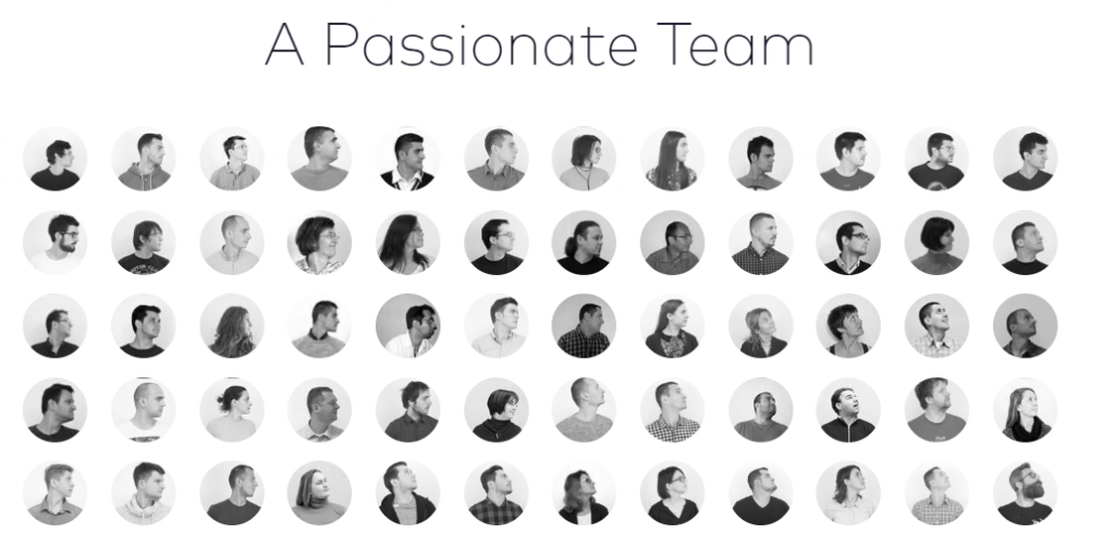
When you look at Lateral’s about us page, it strikes you as a hodge-podge of people’s heads looking in every different direction to which you move your cursor.
In addition to these moving heads, you can also find the name of every team member by hovering your cursor over his/her head, during which he/she gazes directly at you, and the other heads gaze at him/her.
It’s such an innovative architecture that makes the visitor feel a different sensational technology.
Below these heads are the links to their six offices across the globe, through which we can migrate from one office to the other using the Google Maps symbol of the world map below the current page.
In addition to the features outlined above, Lateral’s ‘about us’ page has links which help migrate the visitor to their related pages and details of their services.
Above all, they have a ‘contact us’ link so you can contact them directly from their website.
6. Target Process
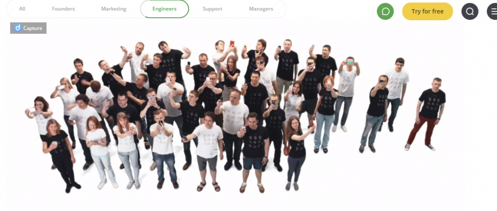
Target Process has got to have one of the most innovative, out-of-the-box, about us pages I’ve ever seen! It’s such a pleasure to click on each department and watch how the people walk in and out of the screenshot with each group making a unique gesture.
Another interesting thing about this page, is that no one among the team claims to be a manager or a founder. This makes the team leadership outstanding.
The page equally shows the core values upheld by the company, and links and hyperlinks that can migrate the visitor to the pages of their partners, services, resources, press, blog, and social media pages.
Another interesting thing is that they are into the provision of software for planning, monitoring, managing, and evaluating work across your organization. They have a live chat link and a demo for their clients on their dashboard.
7. Atlassian
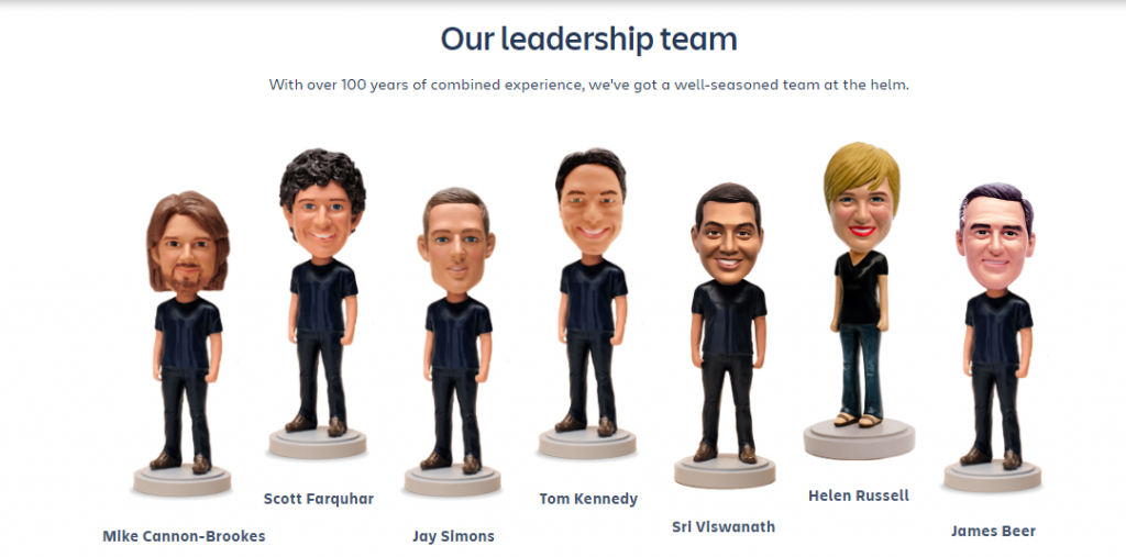
Another fun page among meet the team examples is of Atlassian’s. You’ve probably had a bit of fun at one point in your life with the infamous bobbleheads. Well, Atlassian has used that concept to create their about us page.
This technique ads humor and keeps it real with their clients and gives the entire company a tone that implies fun and humorous but serious about the quality and service they provide to their clients.
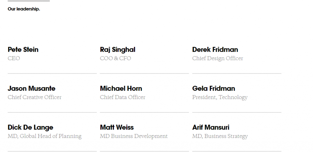
They have a strong and faithful leadership team whose headshots and social media contacts are displayed side by side on their homepage.
The home page equally hosts a link to their products, support tickets, resources, and above all company contacts via direct and social media platforms.
This website means business as they have a ‘buy now’ link at the top of the page, from which you can purchase their products and services.
8. 6tematik
6tematik is another company making to our meet our team examples list.
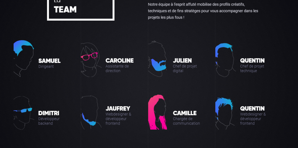
The company that keeps their about us page modern, a little sci-fi, and full of neon color outline. It’s a French-speaking digital company that offers innovative solutions to its clients in the digital space and ecommerce platforms.
They equally have links and hyperlinks that will connect you to their contacts, social media, and success story pages.
Though a real image of the company team is not displayed, the names and positions of the people behind the masks are featured in the neon-colored portraits on their homepage.
9. Etch.co
Etch.co has a nice layout for their personal pages on each employee that works there.
Considering there are only three employees, it makes it easy to provide a more robust profile on each of the members of the team.
With the two-column layout, this profile page is simple on the eyes and makes it easy to find out more about the person you are looking at.
It’s one of the better meet our team examples, especially for small teams to design their pages.
10. Madwell
Madwell can’t be left out when talking about the best team pages. Madwell’s about us page blends together perfect, colorful block elements with nicely prepared bios for each employee.
You can see the box changes from the team member’s image to his/her bio simply by hovering over the box.
On the top right corner of the page is a menu button that takes you to a new page that tells you about their work, team, brief, and contact; and further links you to more details about the company.
They equally have a nice page image with some sort of suspended bonded colored circles which get separated when you hover your mouse over them.
They also have links that display the images and profiles of team members of various branches of the company. Their social media page links are also included at the bottom of the page.
11. Kickstarter
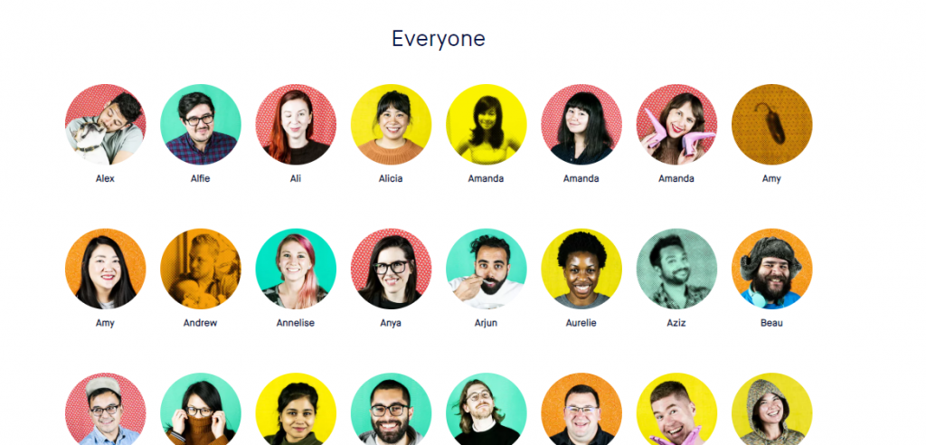
Here is another fun about us page that adds some color along with some playfulness to its team. At the top of the page are the links to the company’s welcome page, services, press, and statistics.
To the top right are a login link and a search button. Then, they have a brief intro of the company and the whole page littered with pictures of team members, their specialties, and their favorite categories.
The amazing thing about these team members’ images is that by hovering over one image, a box pops up with the information about that team member – showing their name, role in the company, and the number of projects they’ve participated in.
Immediately after the images, you can find the various links to pages that provide more information about the services provided by the company, various social media pages, and two dropdown menu boxes that permit you to change the language and currency of the pages.
12. Humaan
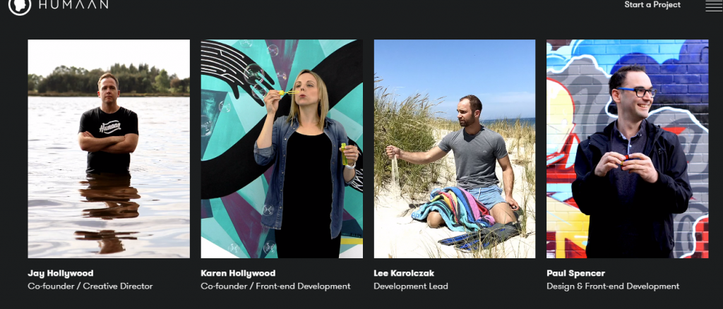
Humaan immediately jumps out as being innovative and fun because of the movement overlays within their about us page.
Even though you can’t see it in the image above, when you go to their about us page, all of the images are dynamic and move to show you some sort of action taking place.
The movement of these images in a certain sense depicts their company name as being truly human.
The fantastic thing about their logo at the top left is that you could click on the triangle inside the box (which will transform into an icon of a human head) to migrate to a parallel web page which is highly animated with links to other pages that pop up when you scroll your mouse wheel up and down.
Humaan is a worthy mention among the best team pages without a doubt.
13. Sparkbox
Sparkbox has a great layout for the simplistic website owners out there who want the classic, subtle look with no fluff.
If you scroll over these images, there is no bio about the people, but it’s something you can always add if you felt it was necessary.
However, just below the images of each team member are one to five icon links that give more information about the person, his/her qualifications, his/her social media contact, and other professional details.
In addition to these simple and detailed oriented images and hyperlinks, icons are links that connect you from the company’s one office location, website, and social media page to the other.
It is one of the best meet the team pages, especially for people who like detailed stuff and have a classic taste.
14. Elegant Seagulls
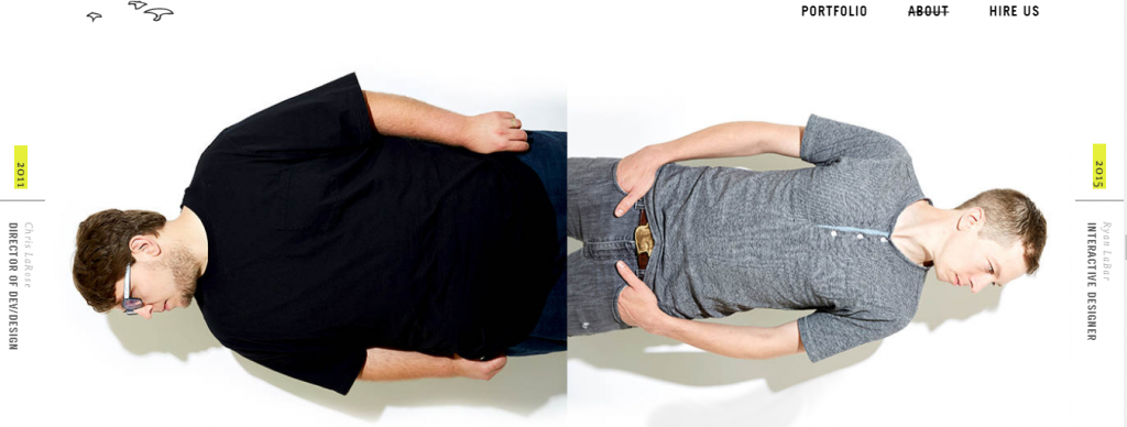
Elegant Seagulls takes quite a different approach to its about us page and uses different angles and positions in which to display its employees. It’s different for sure, and a little hard to look at as it makes you twist your head from one angle to the other.
I still like it as it adds a bit of wackiness to the company’s image. Besides every image is the team member name, position in the company, and the year he/she joined the company.
At the top left side of the page is a signature looking icon on which you can click to get a display of feathers and birds on another page. The page as well has few writings just like the other pages we’ve seen before.
Look like Elegant Seagulls believes that out of the box team page examples work better if you’re a creative agency.
15. Digital Marmalade
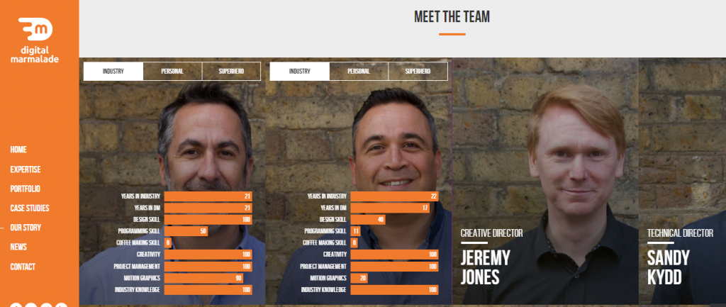
Digital Marmalade shares another interesting style of designing team page examples. It does a great job of combining its team’s profiles with a written story about the company.
When you click on each person’s image, it flips around to the back and displays information about each individual regarding the industry, their personal interests, and who they would be if they were a superhero.
A fun yet very informative way to tell a little bit about each person who works at the company.
16. Smashing Magazine
Smashing Magazine has a unique take on the about us page and uses fun and creative cartoons to display their team members.
What’s different about this page is that when you click on the images, it takes you to the social media profile of the employee where you see his/her real face.
The exceptional thing about this company page it that they, unlike other companies, use mostly writings to guide the visitors with much focus on the social media pages of team members.
Both the bottom and top of this home page contain links and hyperlinks that can help you migrate through the company’s website pages, contact them, and their social media pages too.
17. Efelle
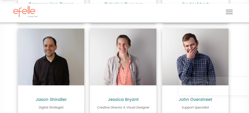
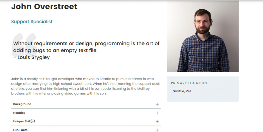
Efelle has a simple yet elegant design to its about us page. When you click on the image of each employee, it goes deeper into their background, hobbies, unique skills, and fun facts.
A short bio is also included next to the image of the employee, which makes it easy to read and learn about who you may be dealing with.
The page has a menu button at the top right which takes you to a page that displays the links to pages of various services, insights, and contacts of the company.
In addition to the company’s direct contacts which are displayed at the bottom of the home page, we also have the company’s social media page links, and email which you can use to find out more about them.
Above all, a direct contact link is displayed at the bottom of the page from which you can contact the company directly.
The best our team pages ideas range from regular to custom, innovation, creative, fun, and what not. At the end of the day, it depends on what you like.
18. Station Four
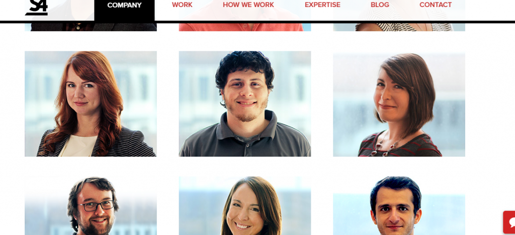
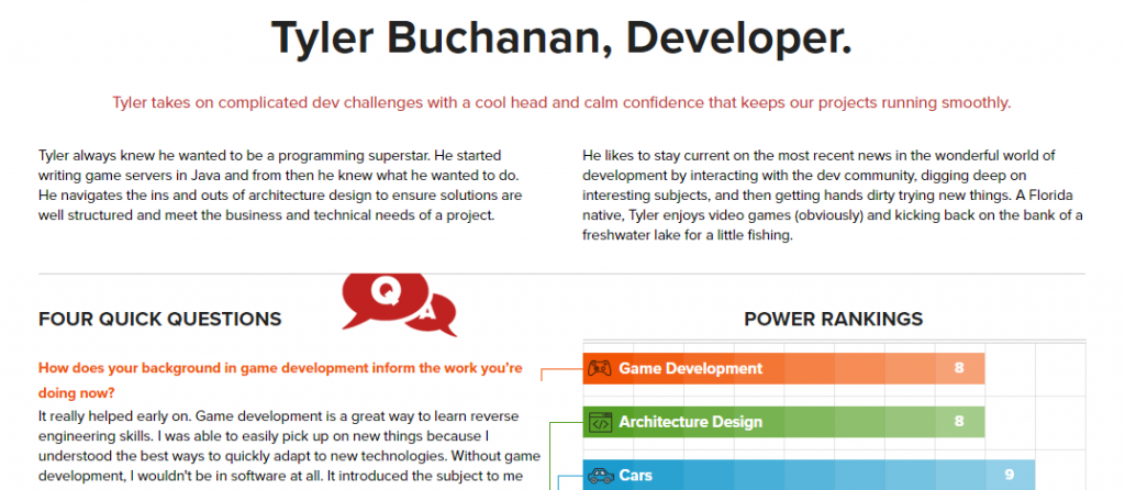
Station Four is definitely among the best meet the team ideas I have seen. It has a great layout that is clean and simple but provides a lot of information on each employee when you click on their image.
As you can see, there is a ton of information about the employee and displays a “power ranking” for each person so that you understand what their strengths are.
At the top of the home page is a line of links that will connect you to various web pages of the company, such as their work, expertise, blog page, contact, etc.
Yet there is also their logo which takes you to a similar web page and displays several things.
The pictures are directly followed by brief writing that links you with some of their famous works and ends by connecting you to more that are included in a link titled ‘check out our work’.
The page ends with the company’s contact information and a host of their social media page links.
Another interesting thing about the page is that you can have a direct chat with an agent of the company as soon as you visit their home page via a box menu that pops out at the bottom right.
19. Huge Inc.
Huge Inc uses the most simplistic way to list their employees but then gets very creative on the backend by showing you more about each one.
Underneath their picture, you will find a full bio on the employee as well as their contributions to the company and their social media links.
The page is arranged fantastically from top to bottom, and the company’s address and contact appear at the bottom of the page.
20. DeCorrespondent
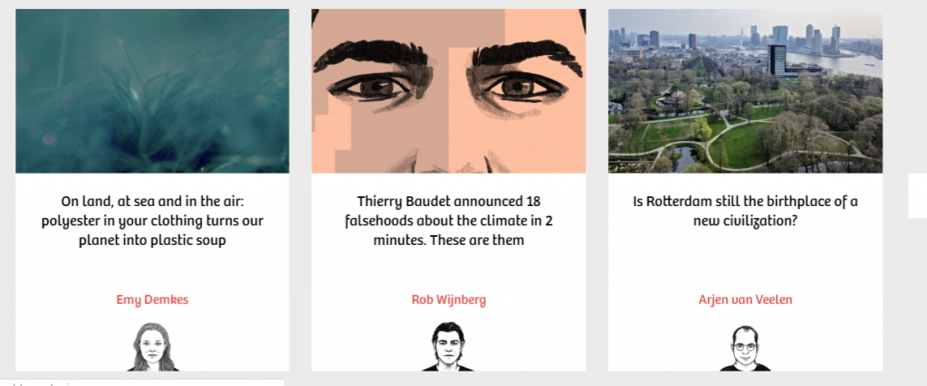
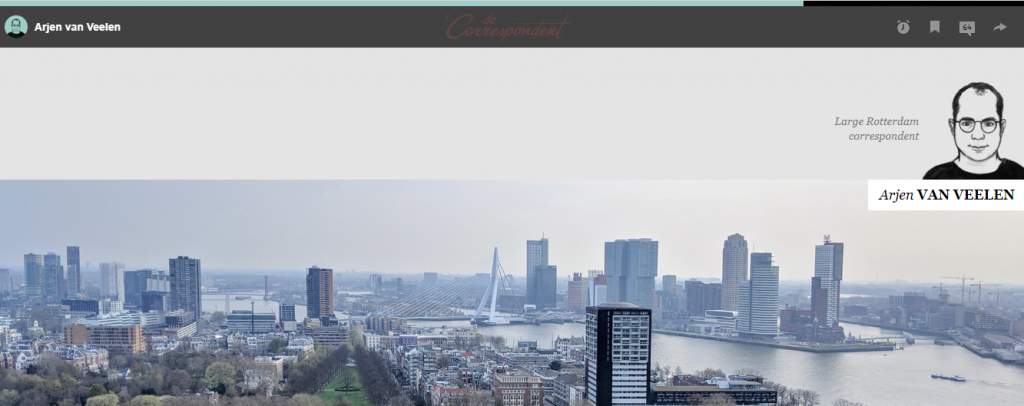
Decorrespondent displays their employees on the home page, but you can click deeper into their profile page and find out more about them.
Another interesting thing about their home page is that it changes its display when you click at the top right to change the language to English.
The English language page is just so elegant that it takes you through the services of the company by various methods, including some video presentations.
At the end of the page are links to the company’s social media pages, contact info, and FAQs.
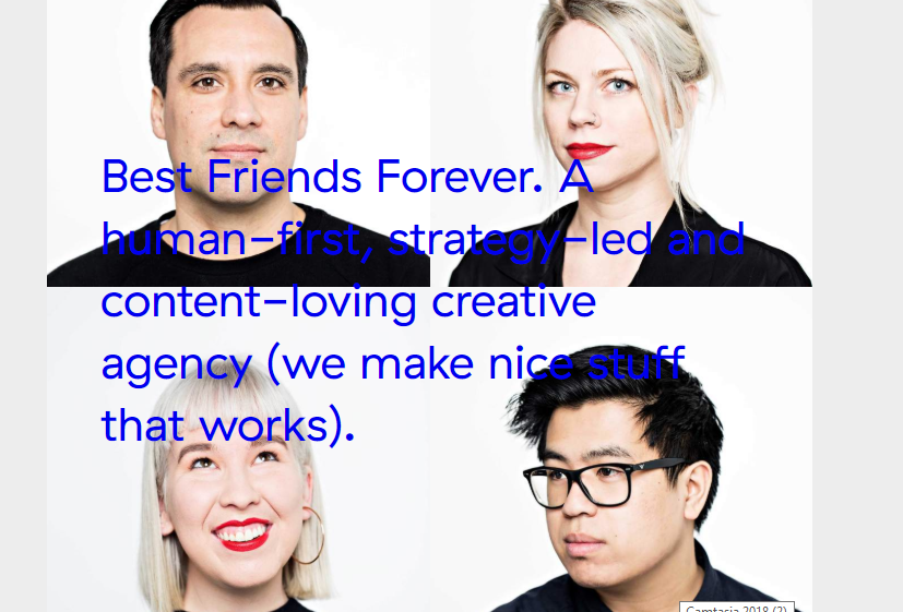
21. Let’s Be Best Friends
Let’s Be Best Friends uses a block-style approach to their page to display their team members.
As you scroll through their home page, the team members’ images are animated and associated with some attention-grabbing creative artwork.
It’s bold and looks amazing as it is directly placed on their homepage so you can instantly meet the people behind the mastery.
Of course, at the end of the home page are a series of links to their contacts, and an Instagram link.
The outstanding thing about this page, is that it gives you the opportunity to comment about their project, which is a great way to connect with the page visitors.
Conclusion
I hope that these meet the team ideas have inspired you and given you some good insights on the different and unique ways to create the best team pages on your website.
With so many different out-of-the-box styles today, and the technology from page builders like Elementor and Beaver Builder, for example, the sky’s the limit when creating awesome meet the team pages to make your business come alive.
Worth Reading : Best Wordpress Page Builders









![Jungle Scout vs Viral Launch [Review]](https://mofluid.com/blog/wp-content/uploads/2019/03/JungleScout-vs.-Viral-Launch-768x402.png)

