Power Bi is an amazing tool that allows you to display important data using easy to understand and interactive dashboards. Instead of poring over sheet after sheet of Excel data, you can generate charts, graphs, and tables side by side that help you understand your data.
You can use several pages in a dashboard or create a single-page dashboard. Either way, these dashboards allow you to get a quick understanding of the state of your company’s profits, financial situation, marketing campaigns, performance, or anything else.
Today, I will be showing you 14 Power BI dashboard examples, covering different industries and metrics. By the end of this article, you will have a good idea of the different types of use cases for Power BI.
Best Power BI Dashboard Examples
1. Social Media Monitoring Dashboard
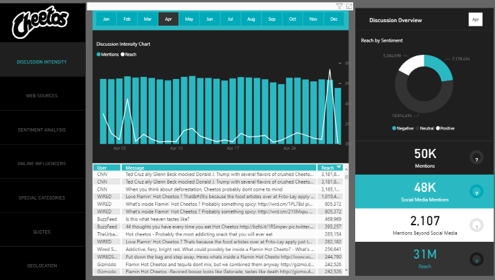
I really like this dashboard because it’s one of the best examples of how a large corporation can use Power BI to monitor social media activity, engagement, sentiment, and more. There are seven pages in this dashboard, which was published on the Power BI Community Forum.
The first page displays “Discussion Intensity.” It shows which articles and posts got the most reach for each month.
At the top, you can select a month, and at the bottom, you see how much reach the top social media posts mentioning Cheetos got, and which users created them. On the right side, you can see how many mentions Cheetos got on social media altogether, as well as a breakdown of what percentage of those posts had a positive sentiment vs a negative sentiment.
You’ll also see how many people those posts mentioning Cheetos reached.
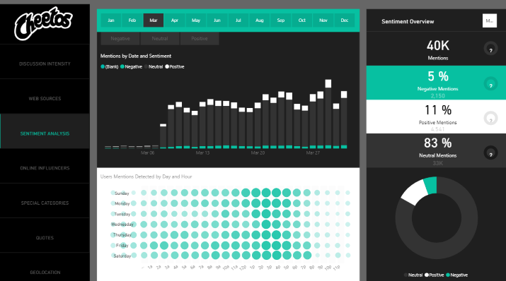
Fast forward to the third page on this dashboard, and we get to the Sentiment Analysis page. This page measures sentiment by day — you can see how much positive vs negative vs neutral sentiment about your company was expressed on social media each day.
If you see a spike in negative sentiment for a few days around a certain date, for example, you should try to figure out what caused that negative sentiment. It could be some scandal your company was involved in, a public figure making a negative comment about you, etc.
The last page in the dashboard displays a geographical map of how many mentions you got in different places, as well as a bar chart showing the top cities and states and how many mentions you got in each.
There are a few other tabs worth looking at, such as the Online Influencers page, which measures engagement from specific influencers.
2. Inventory Stock Analysis
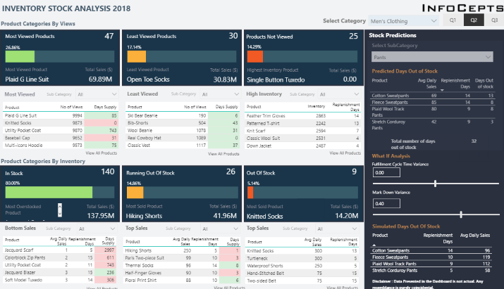
This dashboard allows you to track interest in products, how fast products are getting sold out, which products will soon be out of stock, and more.
When looking at this dashboard for the first time, you will notice several main panes:
- Most Viewed Products
- Least viewed products
- Products not viewed
- In stock
- Running out of stock
- Out of stock
For each of these categories, you will be able to see the top products in the category, as well as how many days supply you have left, average daily sales, or other pertinent data.
On the right hand side, you can calculate in how many days you will be out of stock for certain products, based on daily sales and replenishment days. You can also run a quick calculation to determine “what if” scenarios based on variants in fulfillment cycle time and other factors.
It’s a great dashboard that will help you ensure your most popular products are always in stock, so you don’t lose out on sales.
3. Global Super Store
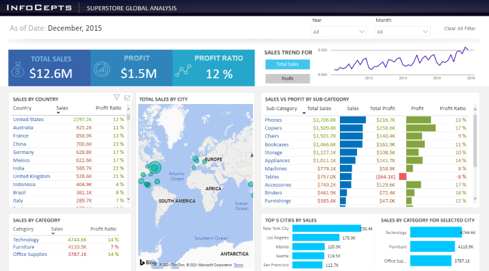
Do you need to keep track of sales across all your branches, in many cities and states? If you operate a super store chain, this dashboard should give you a pretty good idea of how to use Power BI to track sales.
Right at the top, you’ll see three important statistics: total sales, profit, and profit ratio. Under that, you can see the total sales and profit ratio for each country, with the top countries by sales ranked first.
Click on any country in that list to zoom into specific sales data for that country.
Next to that, there is a map showing how sales are distributed across cities around the world. You can zoom in on the map to see more specific data.
You’ll see a sales trend graph, as well total sales, total profit, and profit ratio for different categories. That’s for worldwide sales, but if you want a breakdown by category for a specific country, you can click on the country in the list on the left side, as I explained already.
There’s more data to be gleaned from this dashboard, so head on over and play around with it for a while.
4. Customer Analysis Dashboard
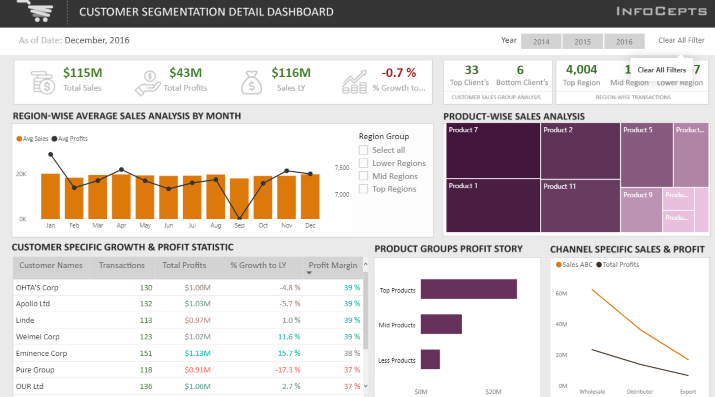
This dashboard drills down into client data. It helps you understand which clients are bringing in the most sales and revenue, and which are bringing in the least, allowing you to refocus your efforts on what matters most.
You’ll see a list of your top customers, along with data such as total transactions, total profits, and more. There is also a breakdown of the percentage of top products contributing to your total profits.
On the second page, there’s also a map breaking down top clients by geographical location. As always, there’s a lot more data in this dashboard, more than what I can cover in this article, so check it out yourself.
5. Sales Scorecard: Where Are We Losing Money?
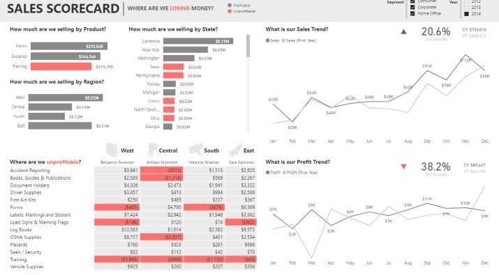
This dashboard helps you figure out where your money is going. If your business is losing money, and you can’t figure out where you are spending it all, this dashboard can help you get a grasp on your data.
At the top left, there are a few bar charts breaking down things like:
- How much you are selling by product
- How much you are selling by region
- How much you are selling by state
Under that is where you can see where you are unprofitable. You will see a list of your products, along with a breakdown of regions, with unprofitable regions highlighted in red.
You can quickly determine, for example, which products to stop promoting and selling in certain regions, or where to up your marketing campaigns.
There are also charts displaying your sales and profit trends for the current year as compared to the previous year. Has it improved, or has your performance decreased?
6. Attendance Tracker — Improving School Performance
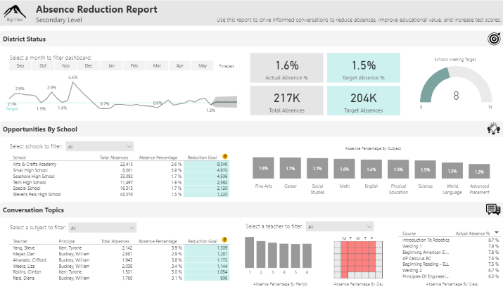
This dashboard helps school districts track attendance to improve overall attendance and reduce absences. At the top, you can see a graph showing attendance over time, as well as total absences vs target absences, both in terms of total absences and absence rate.
You can also see how many schools are reaching the target absence/attendance rate, and the percentage those schools make up of the total number of schools in the district.
There is also a breakdown of total absences and absence percentage by school, as well as the number of reductions in absence occurrences each school needs to reach in order to reach the target goal. You can sort this breakdown by total absences, absence rate, or reduction goal.
Not only is there a breakdown of absence rate by school, but there is also one for each subject. If you see a certain subject has a consistently high absence rate, consider taking measures to make it more interesting to students or otherwise incentivize students to attend classes.
You can also see a breakdown by teacher, allowing you to see which teachers have the most students skipping class and which have to reduce the number of absences the most. There is also a breakdown by period or course — that’s a lot of in-depth data!
7. Seattle’s Construction Climate
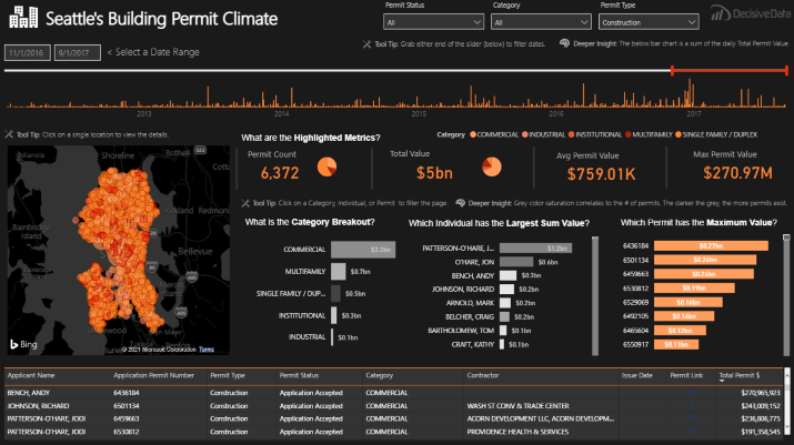
This dashboard breaks down the Seattle construction scene — specifically, issued building permits and their value.
Right away, you can see the total number of permits and their combined value, as well as the average permit value and the top permit value.
There is also a category breakdown, so you can see how many permits were issued for commercial buildings, multi family homes, single family homes, institutions, industrial buildings, and so on.
You’ll also see a breakdown of the top permit holders as ranked by value. Also, there will be a list of the top permit numbers, ranked by value.
8. Power BI Release Plan
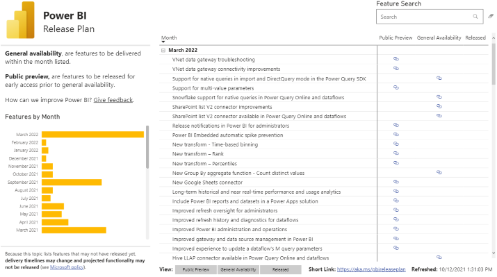
This dashboard was added to the Power BI Community Forum by an employee, and it provides a breakdown of feature releases for Power Bi. For each month, you can view a total list of all features planned to be released, as well as whether they will be released for public preview (early access) or general availability.
There is also a bar chart breaking down feature releases by month, so you can see which months had the most releases.
That’s pretty much all there is to this dashboard — a Power BI dashboard doesn’t have to be complex; it can be simple and focused on just one or two data points as well.
9. If I Were A Rich Man — A Bitcoin What-If Calculator
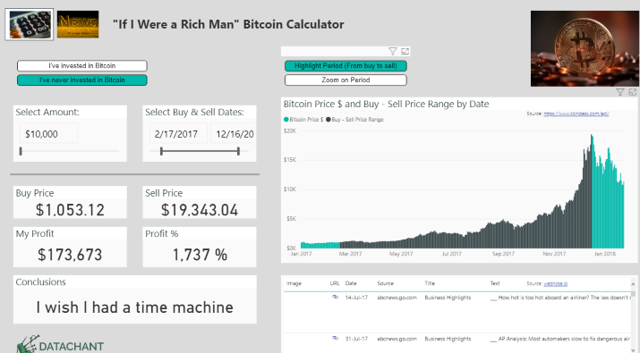
This dashboard is quite interesting, with a humorous name. It basically allows you to imagine what it would be like if you had invested a certain amount of money into Bitcoin at a certain time, and if you had sold your Bitcoin on a certain date.
Start by entering the amount you wish you had invested, and then choose both a buy and sell date. The dashboard will generate:
- The buy price at that date
- The price of Bitcoin on the sell date
- The profit percentage you would have earned
- The total profits you would have taken
- And the conclusion — “I wish I had a time machine” — which I found pretty funny
On the right side, the dashboard will generate a graph displaying the trend price of Bitcoin from the buy date you entered until the sell date, as well as a bit before and after. That way, you can clearly see how much it has risen and make yourself even more miserable!
Nevertheless, this dashboard is pretty fun to play around with, and it can motivate you to invest more into new crypto projects while the time is still ripe.
10. Measuring Your Productivity
This Power BI dashboard displays results from a survey about productivity. The survey was conducted by Levo and Microsoft Office.
It has six pages, so you’ll have to flip through all the pages to see the full survey results.
I’ll quickly summarize the pages for you (pages 2-5 display answer results for specific survey questions):
- Introduction
- How important was productivity for your happiness? You can select an age range to see the percentage of people who believe that productivity is important for happiness
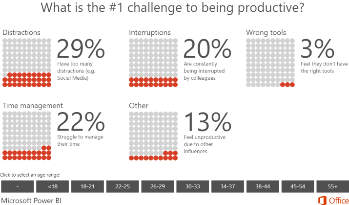
- What’s the #1 challenge to being productive? You can see how many people responded with:
- Distractions
- Interruptions
- Wrong tools
- Time management
- Other
- What would help you increase your productivity? See how many people answered:
- Creating to-do lists
- Creating calendar tasks
- Taking breaks
- Exercising
- Caffeinating
- Meditating
- Taking power naps
- What time of the day are you most productive? See how many people answered:
- Early morning
- Mid morning
- Lunchtime
- Afternoon
- Evening
- Late night
- Thank you for reading!
Each page allows you to filter by age. Also, each page uses a different type of chart to break down the results, to spice things up a little.
This dashboard is very simple, but it shows you how you can use Power BI to display survey results — even from surveys that contain just four questions — in a fun and easy to read way.
11. Financial Performance Overview
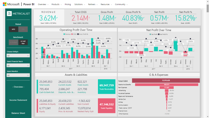
As the name suggests, this dashboard helps you review your financial performance. You can see your total revenue and how it matches up to your revenue goal, operating profit over time (broken down by both month and quarter), and net profit over time.
At the top, you can also see your total gross profit, gross profit percentage, total cost of goods sold (COGS), net profit, and net profit percentage. You’ll also see your goal for each of those metrics, so you can quickly determine how much more work you have to do.
At the bottom, you can see a breakdown of your assets and liabilities, including total assets, current assets, fixed assets, bank and cash balance, inventory, and more.
Next to that, you can see your general and administrative (G&A) expenses, broken down by category, such as rent, salaries, advertising, and so on.
On the left, you can filter for a specific month, financial year, and more, or you can choose a benchmark to compare your current results to, such as last year’s results.
12. How The Internet Works (Back To School)
Another way you can use Power BI is for school projects or for educating your class. It’s not just for businesses — educators will find it very useful too!
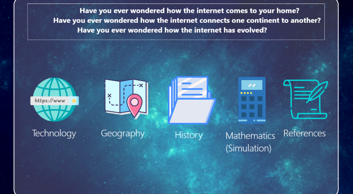
This particular dashboard, which has several pages, shows students how the internet works in a clear and simple to understand way.
The first page, which you can see in the screenshot above, is just an introduction. The pages that follow use fun facts, quick explanations, and interesting graphics to give the full story of how the internet works to connect people all around the world.
For example, on the third page, it uses a bar graph to teach students the number of internet cables in different countries. Check it out!
13. French 5th Republic
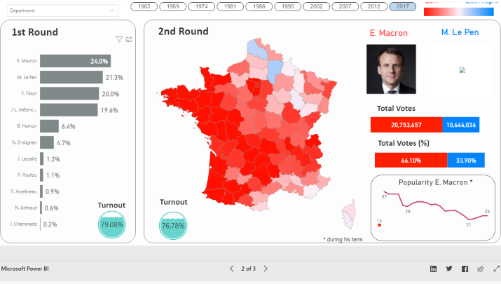
This is a pretty interesting dashboard showing election results in France from 1965 through 2017. You can click on any election year at the top to pull up results for that year’s election.
You’ll see pictures and names of the top candidates (left over after the first round), along with the total number of results each got and the percentage of the vote they both got. Also, you can see a graph displaying the popularity of the victor during their term.
On the left, there is a breakdown of the percentage of the vote each candidate got in the first round (not only the top candidates). You will also see total voter turnout.
For the second round, you can see a geographical map breaking down results for the top remaining candidates.
14. Hospitality Insights
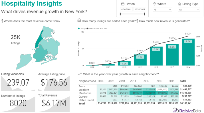
This dashboard gives you insights into the hospitality industry in New York. Using it, you can understand crucial things such as which areas are driving the most revenue, the average listing price for a night, the total number of listings in New York, and the total revenue generated by the hospitality industry in New York City.
The dashboard also shows you a chart displaying how many new listings are added each year across the entire city, as well as how much new revenue was generated each year, and how the increase correlated with new listings.
Also, you will see a breakdown of industry growth by neighborhood, such as the Bronx, Brooklyn, Manhattan, etc.
Final Thoughts
There are many more awesome examples, but I can’t fit them all into this article.
However, I hope this article provides you with inspiration, regardless of what you are using PowerBI for.

