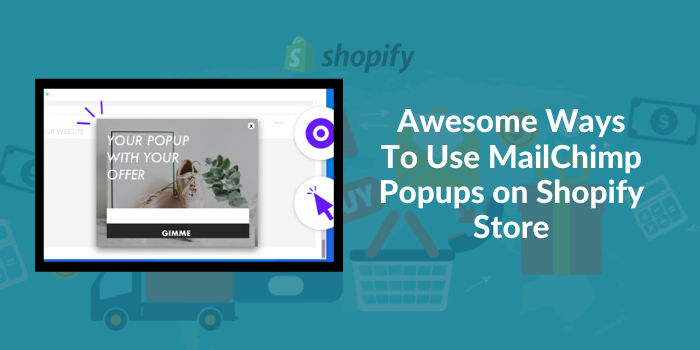
Editor’s note: MailChimp pop-ups help you engage your visitors, learn more about their buying habits, capture their contact information and of course, discourage them to leave the cart midway. To learn how you can use MailChimp pop-ups on your
With the right tools and tips, it’s possible to generate more sales from your
There are several things you can do to optimize your store and increase conversions besides just boosting traffic.
Instead of spending your efforts and money to attract and drive more traffic to your store, you can optimize and see your conversion rate skyrocket, ultimately driving more traffic in.
One of the best ways you can use today to increase your conversions and generate more sales is by using MailChimp popups.
We’re going to explain what they are, how they work, and how you can add them to your
We’ll also share some awesome ways you can apply this tool to your store to boost your conversions.
Why Your Shopify Store Should Have Popups
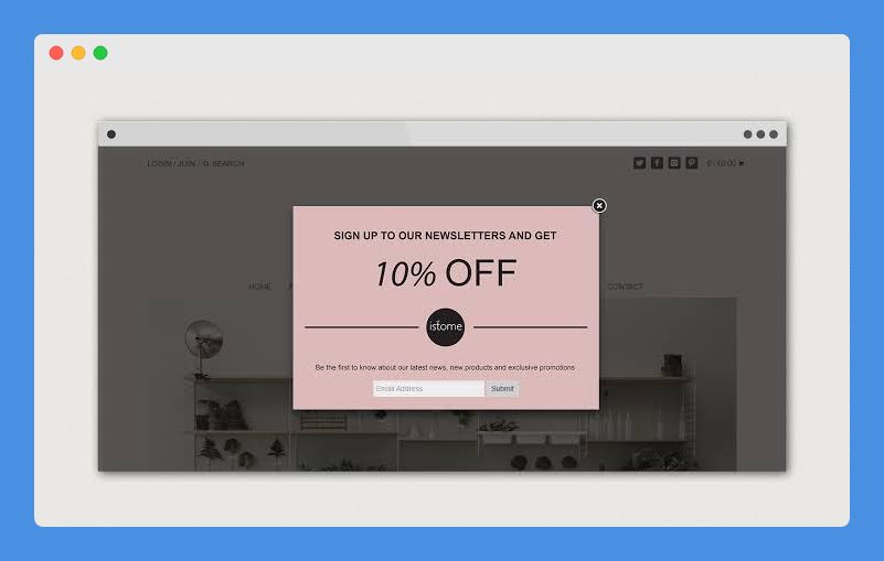
Popups are a necessity with any online store, so you need to use one if you haven’t started already.
It’s not a must, but considering the chance that you could skyrocket your conversions, it’s one of the highly recommended things to implement in your store right now.
The purposes of a popup are several, from announcing your store’s special discounts, best-selling items, and even encouraging the customers to purchase your items.
Also Read: Best Pop-up Apps For Shopify
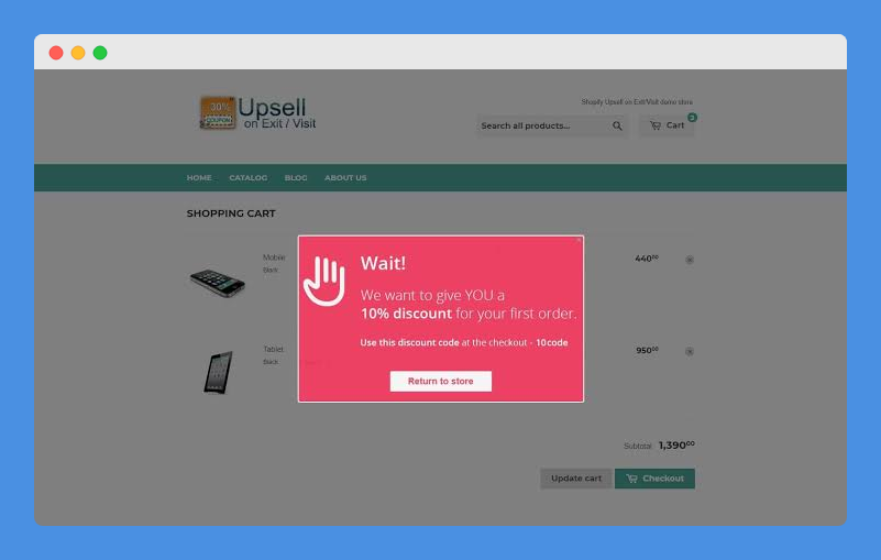
However, its main purpose is to deliver a powerful call-to-action, which translates to lead generation that’s another point for your conversions.
Popups also give you more chances of converting shoppers, because it’s something they can’t miss at all.
Therefore, you need to focus more on how to bring shoppers back and turn them into loyal fans of your store.
There’s no magic pill as to how you can increase conversions on your
The magic is in a repeatable and scalable process that’s been tried and tested, and using popups is one that will work beautifully to grow the conversion rate.
What Are Mailchimp Popups?
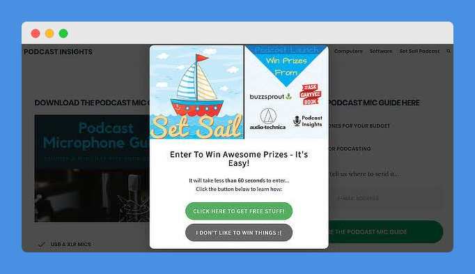
Popups aren’t everyone’s favorite, but when used properly, they can make the browsing experience much better, in turn driving signups, increasing engagement, and generating more revenue for your store.
Once you set up your MailChimp account, you can send emails out to attract traffic to your store.
However, you won’t have a contact base to send emails to.
This is where MailChimp popups come in.
MailChimp popups are used to create free, mobile-friendly and highly customizable forms as they don’t need any coding to start, plus, the signup process will be painless for your subscribers.
They’re a powerful way of capturing emails and converting visitors into subscribers, as they have a higher percent subscription rate.
They also work with any theme, are mobile-friendly, and don’t slow your site.
Plus, you can control whether they open after a delay or immediately, or specify where they should appear.
Let’s look at the common types of MailChimp popup formats used, some awesome designs currently used by brands today, and how you can create and use them on your
Common Popup Formats Used On Shopify
One of the main popups used today on
They’re a great way of reaching out to shoppers just before they officially abandon their carts.
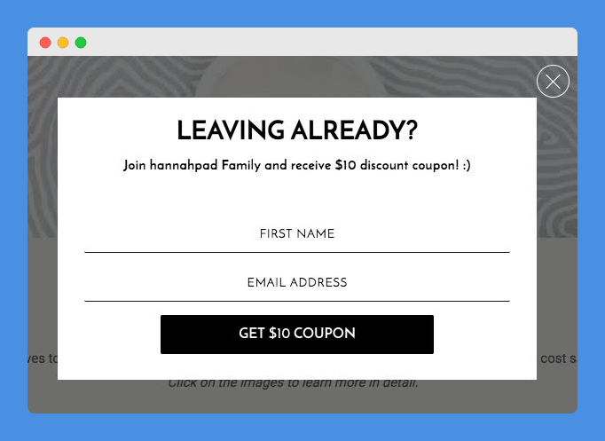
With exit-intent popups, which rely on mouse cursor tracking, you can catch shoppers just before they reach to close the website.
On average, they outperform conventional popups by more than five percent, as they don’t impact on the user experience, plus they can work on mobile using the mobile exit-intent script.
Also Read: MailChimp Review
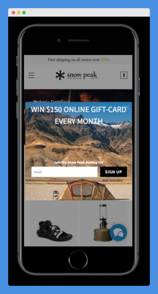
There are other popups like slide-in, which are the least intrusive as they simply slide into users’ screens from either side and don’t obscure them from viewing the content on your store.
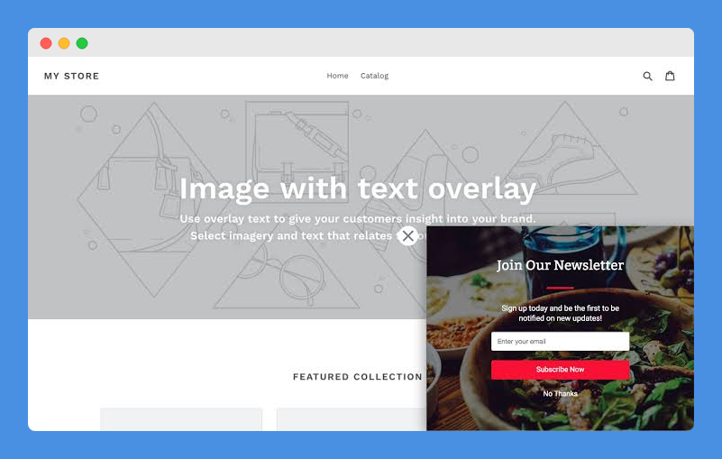
Email popups also exist to help you grow your email list by getting shoppers who aren’t registered to join your mailing list.
Mobile popups can be in the form of email, exit-intent or slide-in formats, but tailored for mobile device displays.
However, each of these formats is best used for specific purposes and in specific scenarios.
Ultimately, the goal is to keep your store’s visitors engaged, and moving forward in their buyer’s journey.
Using MailChimp Intelligent Popups
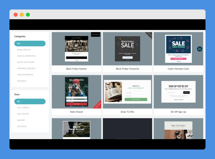
Also known as WisePops, these intelligent popups help you create and run high-converting campaigns on your
They make it easy to create great MailChimp popups that match your store’s design and identity, by just dragging and dropping the blocks to your site.
Once added, customize the color, size, fonts and save them.
These popups let you set when, where, and how they’ll appear on your site.
They also include advanced display targeting controls compared to other tools, and you can track each campaign’s conversion.
More than 50 beautiful templates are available that match your brand that you can use to convert and drive sales.
You can also customize them to have the same look and feel like your store or brand and fit in your site seamlessly.
They’re mobile-friendly and integrate with Google Analytics and Zapier. Plus, they offer advanced targeting options and geo-tracking.
By integrating with MailChimp, you can simply connect your popup with any mailing list on the platform in one click, and choose to activate a welcome email or double opt-in settings.
Explore: Shopify Checkout Popup Apps That Boost Conversions
5 Awesome Ways To Use MailChimp Popups On Shopify Store
MailChimp popups can enhance your store visitors’ experiences in many ways.
We’re going to go over five awesome use cases to show you how using them in your store can be effective.
1. Capture visitor emails and sign-up forms
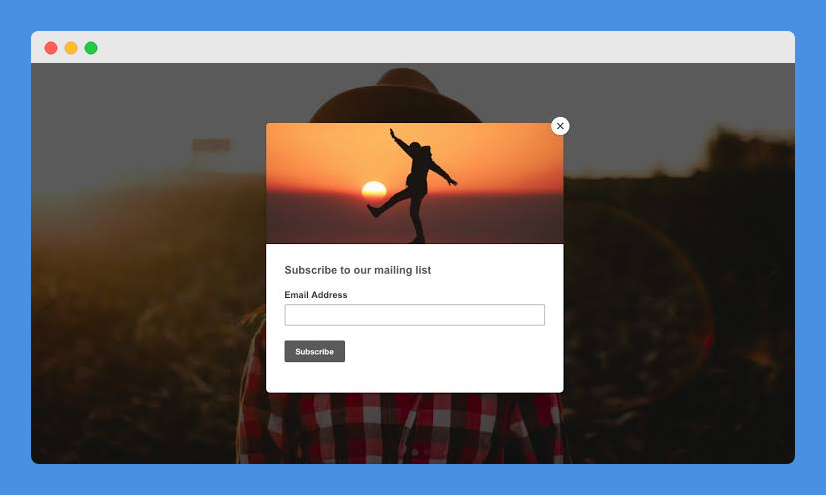
MailChimp popups can be used to capture customer or visitors’ emails, especially first-time visitors.
This way, you can grow your client email list, increase the number of repeat customers and ultimately increase revenues.
Popup signup forms help you connect with your store’s visitors, plus you can add a discount or special offer to grow your audience and generate more sales.
With the MailChimp email capture popup, you or your site’s admin can create a custom popup that’s an amazing email subscriber app.
You can use it with a subscription form for the best results, and if you want, you can embed videos, images or other custom/HTML content in the popup.
Your store visitors can subscribe and their emails added to your MailChimp mailing list.
It’s also a simple but flexible way to get them subscribed to your newsletter while increasing conversions.
It also helps you give users reasons for subscribing and allure them to subscribe by showing new ads or banners on the popup.
2. Newsletter popups to engage customers
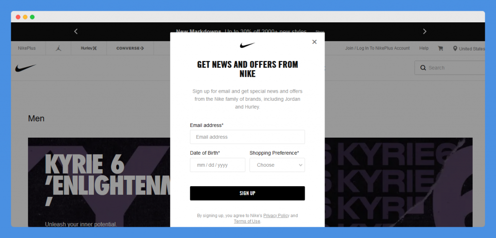
This is another way of collecting user information while engaging your store’s visitors with your brand.
It’s especially useful with first-time visitors who may not buy something from your store off the bat, so you want to at least have their contact information.
Some cool popups let you convince people to subscribe to your newsletter.
You can add branded offers and encourage people to drop their email address, by using beautiful and capturing designs, with visually appealing images, and using copy that makes them feel like they’ll miss out on something good.
You can also highlight your offers or discounts as one-time opportunities, creating scarcity and a sense of urgency.
Non-intrusive ways of doing this include adding a CTA to a notification bar on your store with several offers so that visitors can be convinced to subscribe to your newsletter.
3. Learn about customers
Popups can also be used to know more about your store’s visitors and their experiences with your brand so far.
You can add a quick survey, which visitors can fill based on their interests on your store, and offer content around their interests.
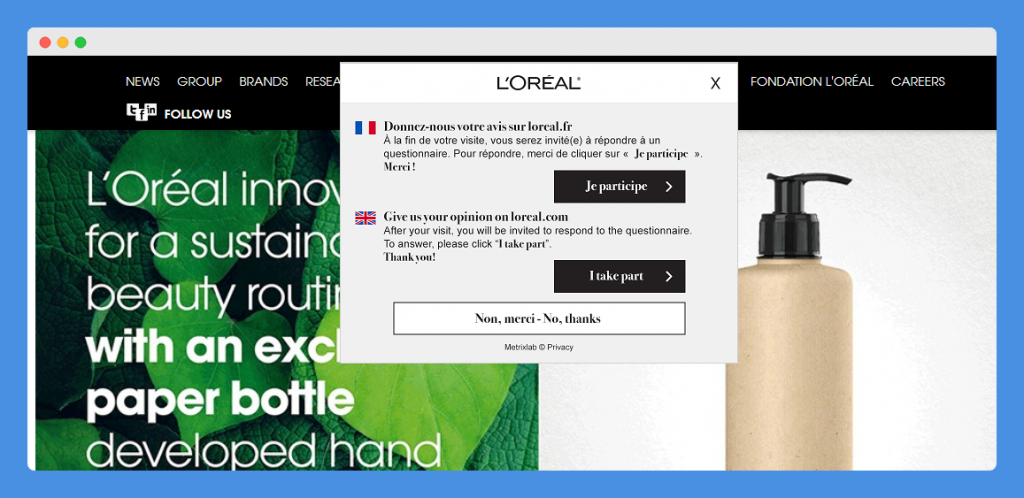
Alternatively, you can collect feedback during check-out using a MailChimp exit-intent popup for those abandoning the store to know about any potential friction.
Explore: Best Shopify Newsletter Popup Apps
4. Increase customer spend per transaction
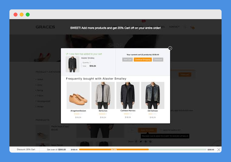
This is a simple way of increasing the average order value of your customers in a single transaction using popups.
They’re effective in getting customers to spend a minimum amount by offering free incentives like gifts or shipping, and even coupons to those who surpass the minimum amount.
For example, if a customer spends more than $200 on your store, they can get a complimentary gift or coupon worth a certain amount depending on what you decide.
You can also upsell or cross-sell items that offer additional value, to get them to spend more when they visit specific product pages.
This, however, should consider the customer’s phase in the buyer journey, purchase history of customers with the same persona and his or her on-site actions as they browse through your store.
5. Reduce cart abandonment rates
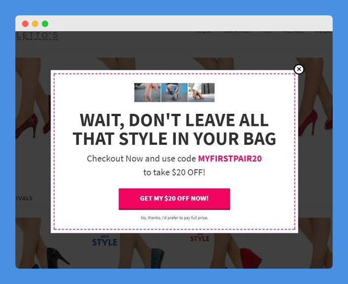
This is another good way of using popups, especially the exit-intent type, which ‘interrupt’ the customer just before they leave or plan to abandon their carts on your store.
You can make visitors more willing to give your store a second try and possibly even buy something from you.
However, you need to have the right message that makes them relate to the popup you’re showing and offer something that’ll make them think twice or they may leave and never return.
For example, you can play on the shopper’s fear of missing out using scarcity or urgency, to get them to think twice before abandoning the cart.
Emphasize that the item may not be in stock later, or highlight that someone just bought it, to create urgency.
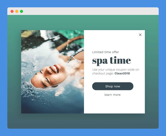
You can also show a limited time-bound discount to instill a sense of urgency, potentially triggering loss aversion for the shopper.
They’ll be more motivated to continue with the purchase.
It’s also possible to get them to enter their emails to unlock a discount or offer, which in turn helps you recover the cart abandoner by contacting them later.
Your checkout page can also use a popup because at this point the intent is at its highest.
Worth Reading: Best Free And Paid Shopify Apps – Ecommerce Experts Recommended
How To Create Mailchimp Popups For Your Shopify Store
The reason why popups are common instead of modal ads is because ads that appear atop your store’s content whenever people visit it are among the most despised today.
This is based on a report by the Nielsen Norman Group, a company with a
On the other hand, VIEO Design adds that customers not only dislike popups, but they also hate bad ones that are generic, don’t add value, interfere with the user experience, are flashy and loud, and not user-friendly.
About half of all
A study by Wisepops shows that 76 percent of the stores analyzed showed a popup immediately users landed on their websites.
It’s no wonder most consumers don’t like popups compared to other forms of advertising, especially if exposed to poorly designed ones.
However, popups can still be an effective part of your
For instance, Platypus shoes increased their email subscriptions by 144 percent using popups, which just goes to show how effective they can be.
We’re going to show you how to create MailChimp popups for your
Creating Mailchimp Popups That’ll Convert
Frankly, there’s no specific way of creating the ideal popup that’ll convert, but, regardless of their appearance or design, pop ups have a few things in common.
Some of these include targeting specific customer segments, well-planned design and copy, offer value, appearing at the opportune moment for consumers and can be used on all devices.
Each of these and other principles will help you create a good MailChimp popup for your
1. Audience segmentation and targeting
Each of your visitors is different so you’re not going to serve them with the same popups. Instead, create different campaigns targeting individuals in your audience for different purposes.
In this case, you need to define who you’re targeting, when and why they’ll see the popup.
This way you’ll develop different segments from your audience whom you’ll target with popups and create specific ones for them.
You can segment your audience using customer history, content or context targeting.
Content segmentation involves segmenting visitors based on what they view on your store so you can show popups promoting the specific products or other content and relevant offers specific to their interests.
You can also segment by their history and position in the sales funnel.
They could be one-time customers, brand new visitors or long-time brand loyalists.
Finally, contextual targeting is based on variables such as product category, cart value, and many others.
For instance, if you’re a fashion retailer, you can display a popup when customers view items that are sold out.
The first step to targeting audiences is by creating an effecting popup campaign and then targeting the right customers from your audience.
2. Include relevant and valuable offers
Relevant offers are the key to customer engagement using popups, as they help with conversions.
You need to offer value to visitors but start by determining what they’ll care about while balancing what your store receives at the end of the day from the customer engagement with popups.
A good way of doing this is by offering discounts like percentage discounts or free shipping discounts, or a “buy x and get y” offer.
Discounts usually help to motivate shoppers, especially those on your site the first time, to give their email addresses.
You can also use coupons, which is an efficient way of convincing visitors to subscribe to your store.
However, discounts may come with a higher unsubscribe rate especially if you stop offering them, which forces you to discount your merchandise as most shoppers opt-in for discounts.
You can also offer giveaways, contests, freebies, and sweepstakes, a mystery offer, or even branded content such as sneak peeks on new products, exclusive promos, news updates, and first access to sales for subscribers.
Also Read: Best Shopify Exit Intent Apps
3. Get the popup in front of customers at the right time
Timing your popup is important because it determines if visitors will find it valuable or annoying, plus whether they’ll see it in the first place.
It means measuring actual time relative to the actions your visitors take on your store.
For instance, you can schedule it to show after 30 seconds depending on the number of pages they view or the scroll depth.
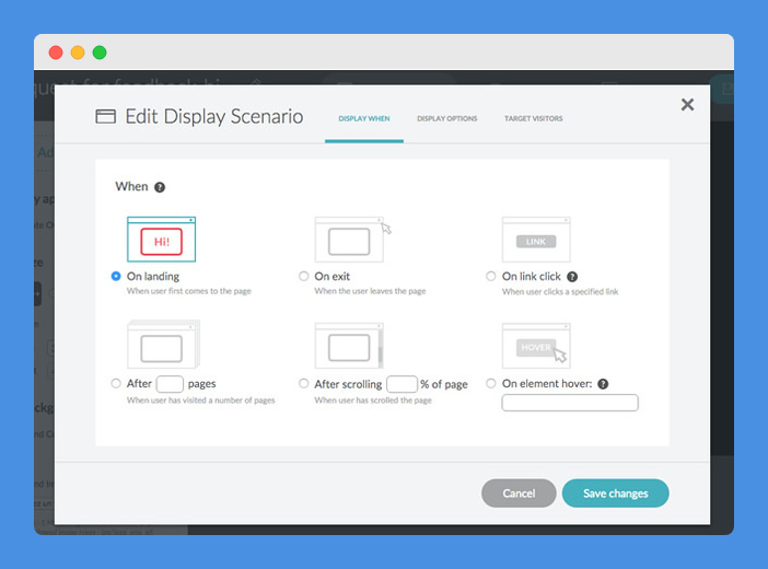
You can time based on mouse movements, hovering over links or images, or scrolling through a certain portion of the page.
Either way, your goal is to determine the actual time and optimal moment to display the popup to specific visitors, and deliver your offer relevant to their context.
Getting the time right also depends on the visitors’ interest and engagement levels; the exact moment their interest is at peak or almost at the point where they won’t be distracted or bothered.
4. Popup design and copy
This can make or break your popup’s effectiveness. A good popup is made with clarity, branding, and brevity.
Your message (copy) should be clear and obvious as to what your visitor should do.
For example, the discount you give should be as clear as the call to action you make, and the layout should be sleek to rouse their attention.
Keep the information on the popup at a minimum so it can briefly interject the visitors with a quick offer, and they can continue with what they were viewing on your store.
Finally, let your popups reflect the overall look and feel of your brand through its design and copy.
The call to action (CTA) should stand out in color, copy or even font style so they can easily find it, and act on it.
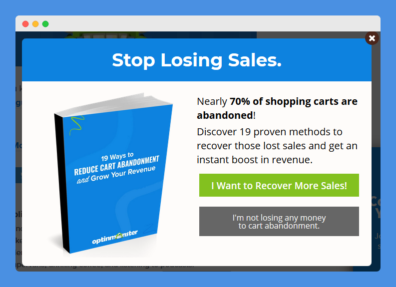
CTAs should be specific and actionable, plus reiterate what they stand to get from your offer.
Add a sense of scarcity, urgency or FOMO, just to reinforce the value you’re offering such that they’ll feel that they’re missing on a special thing.
5. Optimize popups for multiple devices
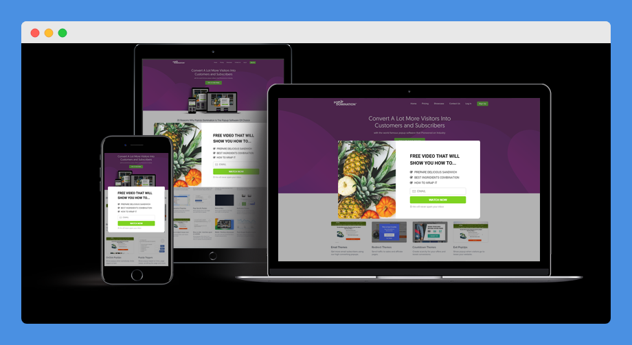
Consumers today use multiple devices like desktops, laptops, smartphones, tablets, and others to fulfill online shopping needs.
It’s therefore important to create
Your popup should work correctly on specific devices otherwise you risk losing a large chunk of your audience.
Plus, Google can also penalize your store too.
Create several versions of one popup and optimize them for specific browsing devices, because going by “responsive” on a template, doesn’t necessarily mean it’s optimized.
You could end up with poorly formatted or slow-loading images, and visitors won’t engage with your popups at the end of the day.
This, in turn, could lead to Google penalties or loss of potential customers.
Good mobile popups should be non-intrusive, compliant with Google and offer a good user-experience without blocking content.
They should also have clear and concise designs for mobile.
Also Read: Best Shopify Cart Abandonment Apps
Final Thoughts
We hope you now know how to use MailChimp popups on your
It’s easy to set up and add popups to your store, but it’s worth noting and considering that most consumers see a popup and the first reaction is to feel frustrated or annoyed.
This happens because most consumers are conditioned to expect the worst whenever they get or see one while shopping or even viewing content online.
This makes it important for you to design popups such that when your visitors or target audiences see them on your store, they won’t be as annoying or frustrating, but as a delight and pleasant surprise.


