The average ecommerce conversion rate is 1.6 percent. A better conversion rate will lead to increased profits and lower advertising costs.
Allowing you to increase your advertising budget and scale up your business quicker.
Did you know your ecommerce images increase conversion rate? The way to do that is by optimizing ecommerce product images.
Another reason to optimize your products’ images and product pages is for organic SEO.
Ninety-three percent of all online activity begins with a search.
If you want to drive organic traffic to your ecommerce store, you need to be properly optimizing your product descriptions for the search engines.
Optimizing your product pages for SEO will help you drive more free traffic, lowering your costs.
While the focus of this article is how to optimize your ecommerce products images.
It’s important to note that a proper product page optimization strategy should focus on optimizing the following five aspects:
- Images
- Title
- Description
- Specifications
- Reviews
How to Optimize Your Ecommerce Product Images
There are several things you need to take into consideration when optimizing your ecommerce product images.
First of all, your images should be unique. If possible, hire someone to take professional photos of your products.
These images should display the product from different angles so that customers get an idea of how the product really looks.
You can have some images showing how the box looks, both from inside and from outside.
Another tip is to show an image of a customer using or enjoying the product, which is common practice with clothing products.
Many ecommerce stores make the mistake of simply using the same products that are provided to them by the manufacturer or supplier.
While that might work if you are in a pinch, it is not the best for SEO.
Letting your customers zoom in on the photos or using images that display the dimensions of the product are also good ideas.
Videos and 3D images are also becoming more popular.
To optimize your images for SEO, make sure that they are unique and that you have included a target keyword in the alternative text.
How to Optimize the Other 4 Aspects
As mentioned, you also want to optimize your title, description, specifications list, and reviews.
Your title should include a keyword that is commonly searched both on Google and on the ecommerce site itself, whether that is your own store or on a platform such as Amazon.
If you are going to include specs in the title, make sure that they are commonly searched terms and include them at the end of the title, rather than at the beginning.
The description should be clear and concise. It should accurately describe the product. Save most of the technical specifications for later.
Having a bullet list of benefits that consumers get from using the product is a great way to increase conversions as well.
Of course, the description should incorporate several commonly searched keywords.
The specifications list should list all particular specifications of the product.
For example, if you are selling a mobile phone, include things such as its length and width, the OS version, which bands it works on, whether it is GSM or CDMA, .
What kind of camera it has, how many megapixels the camera is, and so on.
Finally, make sure to get positive reviews. You can encourage customers to leave reviews through an automated email.
You may also be able to use the reviews from the manufacturer’s site.
Reviews increase conversion rates by providing social proof.
In addition, they contain additional keywords and content and are great for SEO.
Related : Guide To On-page Optimization
13 Ecommerce Product Image Optimization Examples
Let’s move on to our list of examples.
We’ll show how different ecommerce sites have optimized their images and product descriptions in order to get more conversions.
1. Amazon
Of course, we can’t talk about ecommerce without mentioning Amazon. We’ll show you a perfect Amazon image optimization example.
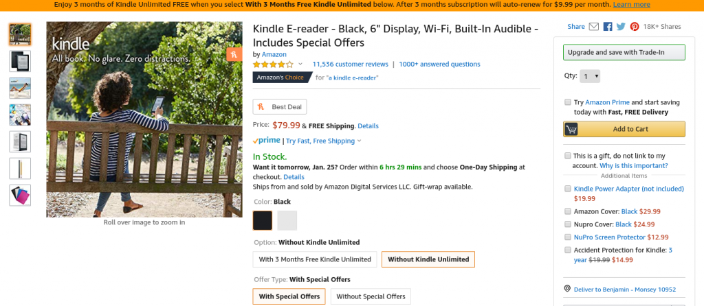
Let’s take a look at how they are selling one of their most famous products, the Amazon Kindle.
Take a close look at their images.
Remember that we said that you should try to incorporate an image of a consumer enjoying the product?
The first image is of someone serenely sitting on a bench, surrounded by nature, reading on their Kindle.
The picture of the girl using the Kindle to read despite the sunlight subtly indicates how there is no glare when using the Kindle.
There are also some beautiful pictures of the product itself:
In the following image, the product is shown side by side with an alternative product, a tablet.
The difference between them in terms of glare from the sun is clearly highlighted.
In the following image, we both have someone enjoying the Kindle and Amazon highlighting how their Kindle is compatible with Audible:
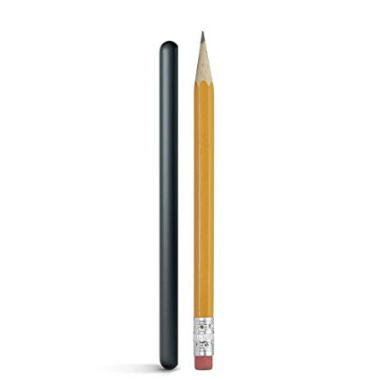
We mentioned that you should try to show the actual size of the product.
In the following image, the size of the Kindle’s pen is shown in comparison to a standard pencil:
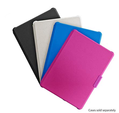
In the last image, we see how Amazon promotes cases for their Kindle:
When scrolling over a product image with a mouse, the user will be able to zoom in on the product.
By clicking on a product image, they will be shown a layover with an expanded view, as follows:
This makes the images interactive, which can increase engagement rates. It’s a great ecommerce image optimization example.
2. eBay
Let’s take a look at a product being sold on eBay.
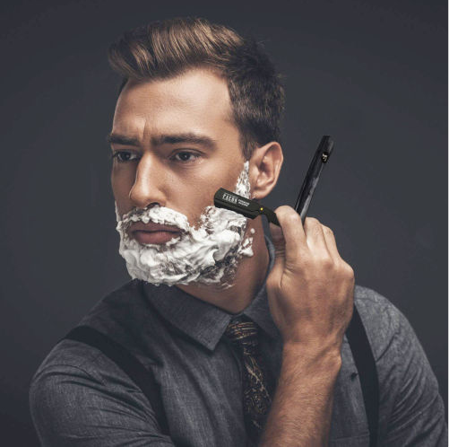
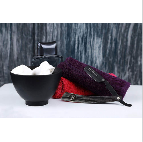
This particular seller, Falcon Razors, is selling a classic razor along with 100 blades.
The first image clearly shows not only the razor and the blades it comes with but also how the box the blades come in looks:
To be fair, there are some photos on this page that are not necessarily helpful for conversions.
However, some of the other images are really great:
The above photo highlights specific features that the product has.
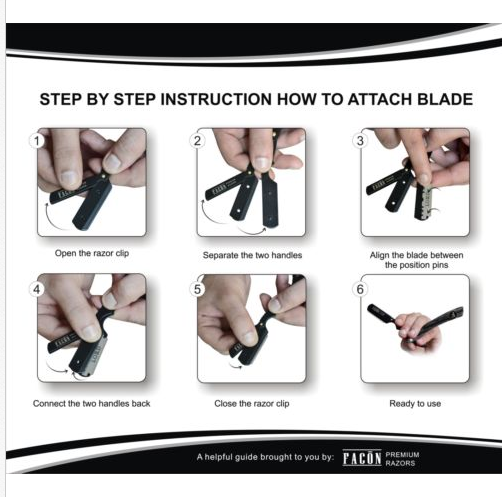
There is also an instructional photo, which can be useful both for customers who are trying to figure out how to use the product.
For potential customers who think that the product looks too confusing for them:
Finally, there are some photos both of people using the product and the product being used in a stylish manner for decorative purposes.
One thing to mention here is that the photo looks a bit unnatural, as if it were painted or generated by software.
Try to make your photos, especially those that include people, as natural as possible.
Photos can be enlarged or zoomed into, which applies to all products on the eBay marketplace.
3. AliExpress
Another inspiring example of optimizing product images for ecommerce site is AliExpress.
AliExpress is a branch of Alibaba. As opposed to Alibaba, which usually has a high minimum quantity and is geared towards merchants making bulk purchases.
Most products on AliExpress can be purchased in quantities of one or higher.
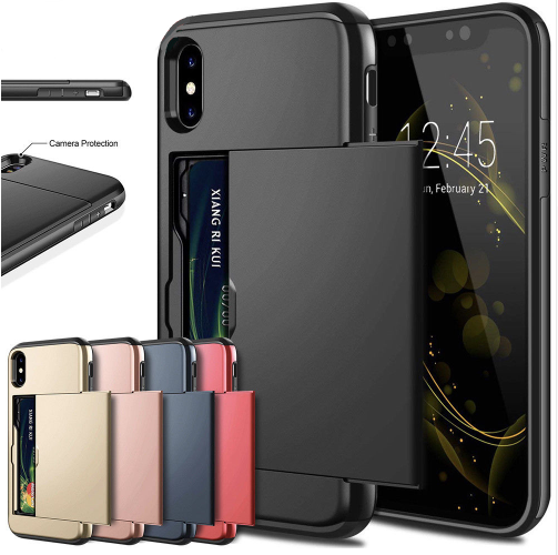
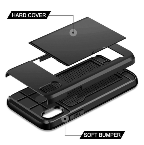
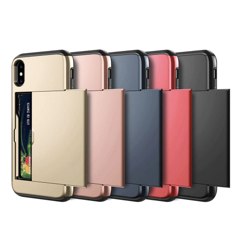
This particular product is a phone case that doubles as a wallet, with a compartment for placing credit cards:
For those confused about how exactly the phone case is designed, the following image helps clear that up:
The next image goes a bit further and shows how easy it is to use and the convenience of owning such a case:
There are other images as well, such as the following one showing another benefit of using this case – protection for your phone when it falls:
The next image is more likely to appeal to sellers wanting to purchase this item in bulk.
It shows that it can be bought in a variety of colors:
Related : Alidropship – Best Aliexpress Wordpress Plugin
4. Samsung
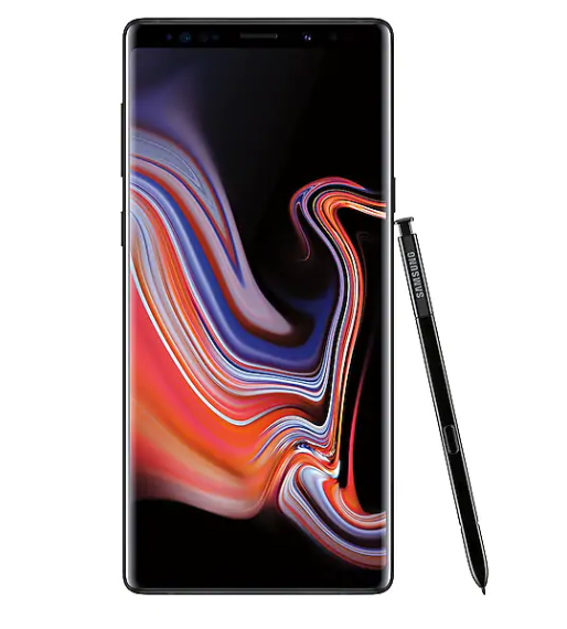
Let’s see how Samsung uses the power of sleek images to get more sales for their mobile phones.
The following is a stunning image of the Galaxy Note 9:
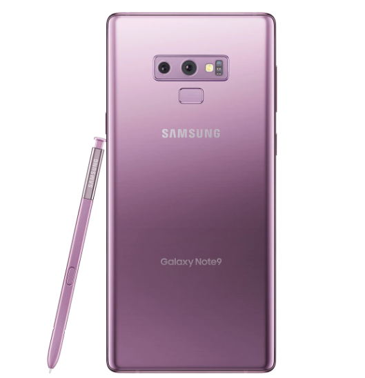
The other images on the product page show the image from various different angles, a technique that we mentioned at the beginning of this article.
Samsung also lets users see the phone in different available colors:
It would be a bit useful, however, if Samsung showed the phone as most people would use it: Turned on with apps on the homescreen.
5. Sears
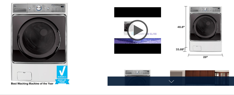
Sears includes a number of images on the product page for a front-load washer:
Users can click on any image to enlarge it or zoom in.
Notice the video. Videos are interactive, engaging, and allow you to truly show the user the product from different angles and how beneficial using the product can be.
One of the other images shows the exact dimensions of the product, another tip we recommended at the beginning of this article.
6. Target
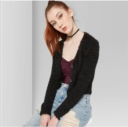
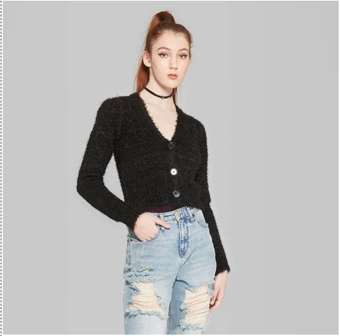
Target is selling a long sleeve button Cardigan.
As mentioned earlier, it’s a great idea to show images of someone using the product that is being sold.
On this particular page, the seller is appealing to the target audience’s desire to be pretty and look good.
The subtle message that is being conveyed is that that can be achieved by wearing the product.
Unfortunately, this particular page is missing an image of the item by itself, which should always be included.
By only including the above images, it may be confusing to some which article of clothing is the one actually being sold.
7. Etsy
The following item on Etsy, a stylish wooden book holder, is meant for decorative purposes.
The images reflect on that by showing how it can be used to decorate the home.
These images are bound to be appealing to those with a sense of fashion and style.
8. Walmart
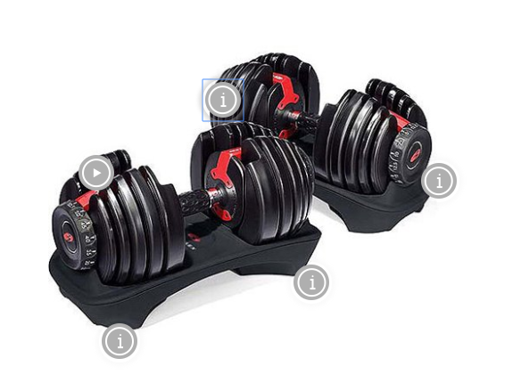
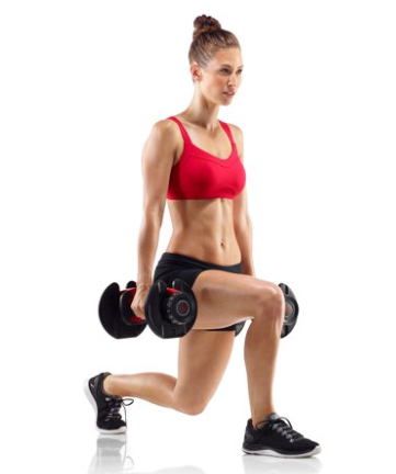
Another ecommerce product optimization example is from Walmart. Here, Walmart is selling a pair of adjustable dumbbells.
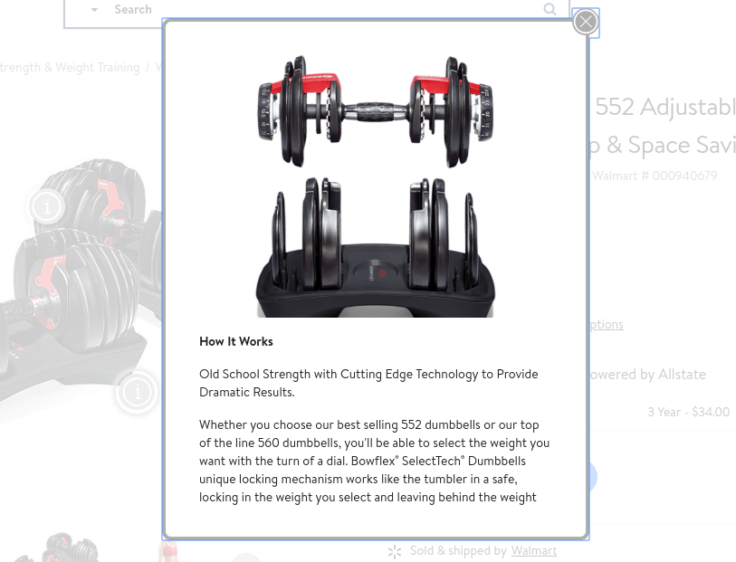
Notice those little icons, which allow users to bring up an informative description or a video layover:
And here is the product being used by someone.
The subtle message is that you can achieve this model’s level of fitness by using the product:
9. Fiverr
Fiverr is an online marketplace where people can sell and buy all kinds of services.
The following seller is offering to create flat minimalist designs and logos:
Notice how they clearly display samples of work they have done, so that the consumer knows exactly what kind of service is being offered.
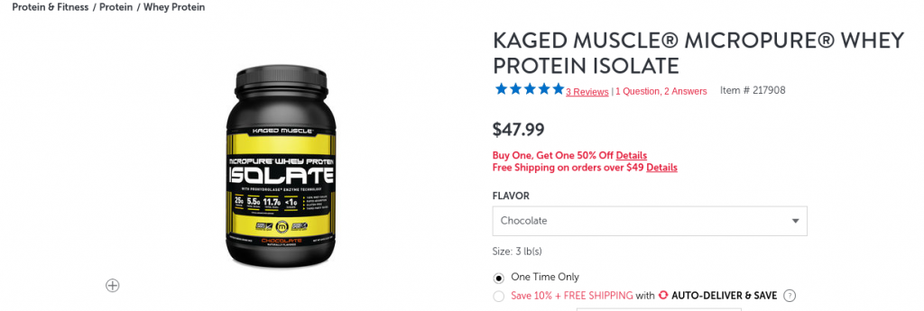
10. GNC
GNC is selling a whey protein isolated powder:
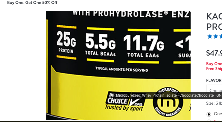
Notice how the image can be zoomed into so that users can see what exactly is written on the bottle in small print:
11. MLB
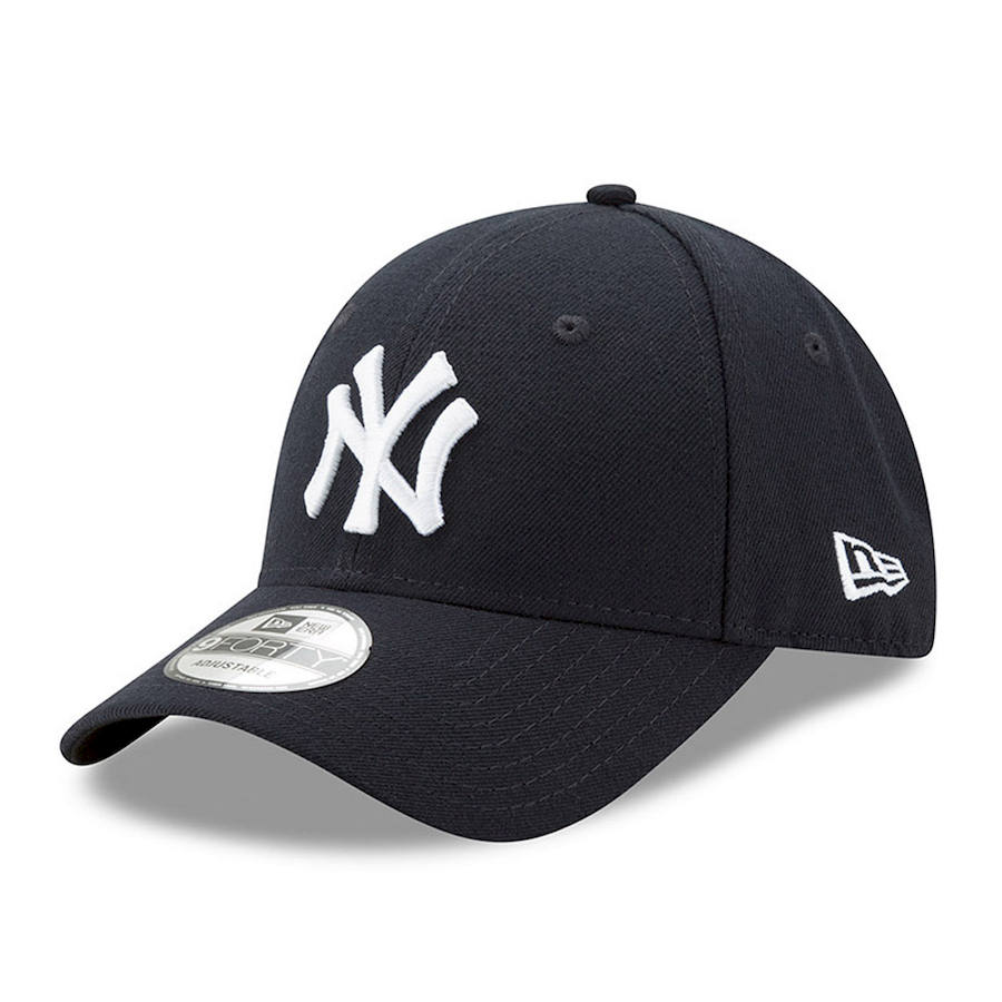
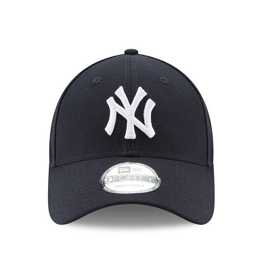
The Major League Baseball store is selling Yankee’s caps.
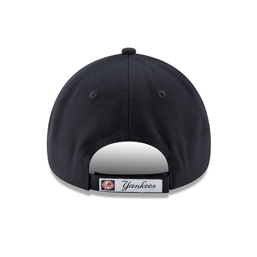
They showcase the product from different angles.
They also clearly show how it can be adjusted to your exact fit:
12. New York Honda Yamaha
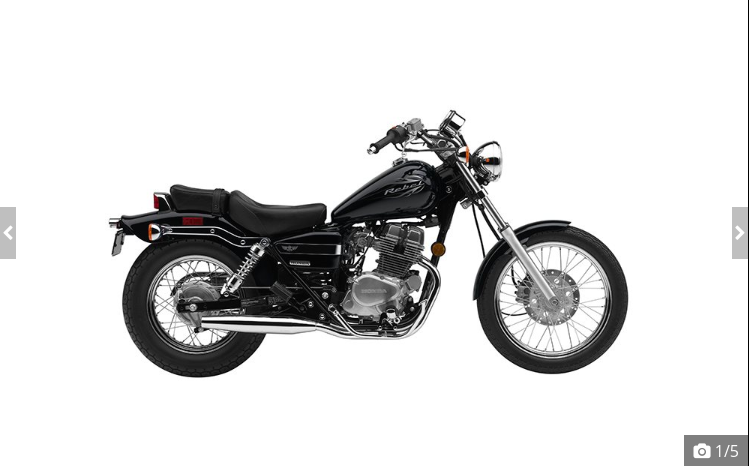
This New York-based dealer sells many different vehicles, such as the 2016 Honda Rebel motorcycle:
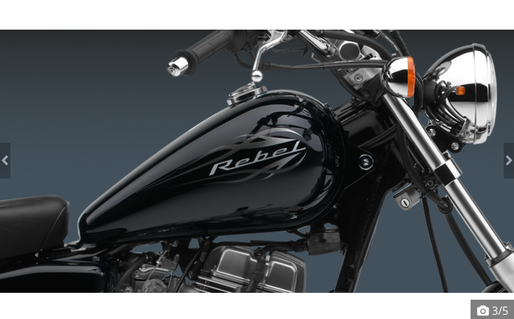
There are some close-ups as well:
However, this page is lacking.
Whether the bike will be shipped to the buyer or picked up on site, there should be additional photos showing the actual bike being sold, as it is a used one.
Nevertheless, it shows that you can sell anything online if you have the right photos.
13. Guitar Center
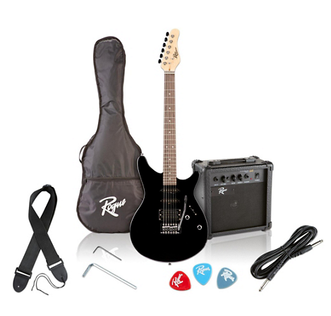
Guitar Center is selling an electric guitar pack:
Notice how they not only include images of each specific item in the pack, but they include several images of the entire pack together to entice the user.
Wrapping It Up
Images are everything when it comes to ecommerce. They will help the product get more clicks and sales.
Use the techniques that are shown in the above 13 examples to take better pictures of the products you are selling.


