
Having an e-commerce store can be an exciting endeavor but also a challenging one.
How are you going to stand out from the rest of the crowd?
How are you going to attract consumers to come to your store instead of your competitors and boost sales?
And once they get there, how are you going to get those potential buyers to stay on your website?
These are all questions that need to be answered, but I can tell you one thing – much of it comes down to a few main factors.
To begin, let’s quickly list a few things that make a good e-commerce website.
This is a great place to start, and then we will get into some of the best e-commerce websites that Wix has designed:
- Visual Appeal
- Website Navigation
- Product Filtering Capabilities
- Easy Checkout Process
- Straightfoward Refund Policies
- Clear Privacy Policy
- Detailed Product Descriptions
- Good Images
Now that we know what makes a good e-commerce website, let’s look at some of the awesome e-commerce stores that have been designed using Wix’s platform.
Whether you want to create your online presence, open a store, start a blog, Wix makes it all easier. Design and build high-quality websites using Wix. What's more, Wix lets you do it for free.
Best Wix Ecommerce Sites & Templates
1. Vintique Watch
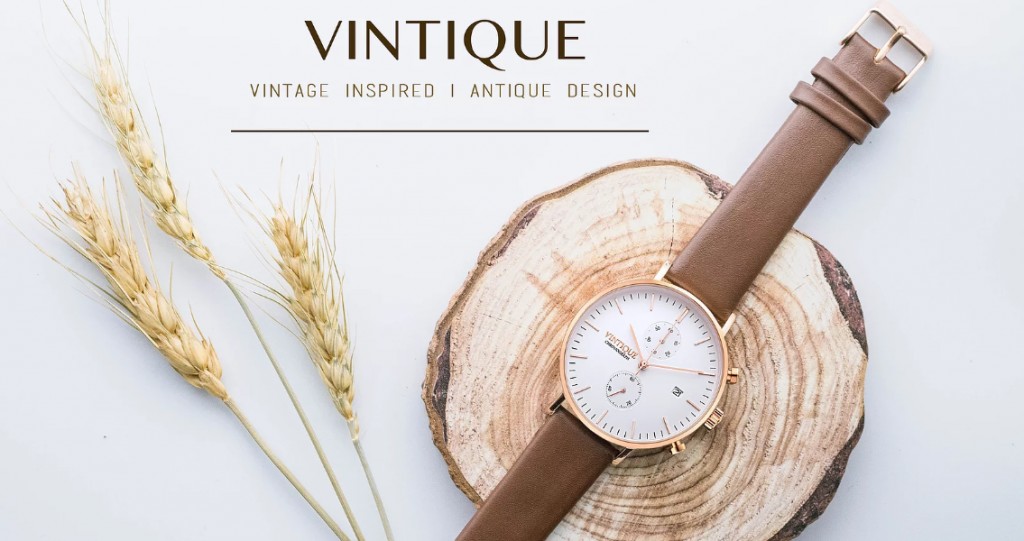
Vintique Watch is a beautifully designed Wix ecommerce website that immediately catches your attention due to its large graphic watch image on the front page.
Right away you can see the easily navigable pages on the home page.
As you click further into the website, you are again dazzled by beautifully photographed images of their various watch styles.
Prices are clearly displayed next to each watch, as well as their sale prices.
Once you finally find a watch that you want and then click onto the “add to cart” page, you will notice the description is very well laid out to leave nothing for guessing if you’re the shopper.
It not only gives you “product information” but you will also notice it lists the “indicator information” for further details.
Vintage Watch is a very nice, classy, and beautiful website that is a great example of a Wix e-commerce website at its best.
Whether you want to create your online presence, open a store, start a blog, Wix makes it all easier. Design and build high-quality websites using Wix. What's more, Wix lets you do it for free.
2. Michael Oren Jewelry
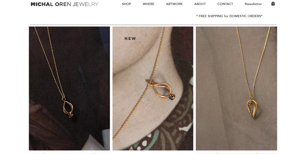
Another great Wix ecommerce site is Michael Oren Jewelry. It uses a very classy and classic design from Wix to make their jewelry stand out and show their intricate designs using the zoom detail from Wix.
You are immediately captivated by the large images on the homepage and the block image layout.
As you scroll down the page, the “shop” button stands out accordingly front and center.
So, not only do you see the “shop” link across the top, but you also see it as you scroll down the page.
Then, as you continue to scroll, you will notice a unique use of their Instagram feed.
If you click on one of the images, it will take you to another page, and you can continue to scroll through the Instagram by clicking the arrow to the right.
It’s a nice touch that brings to life the brand and the image that Michael Oren is trying to create.
Their website clearly lays out different categories of jewelry when you click on the “shop” navigation link.
And as mentioned above, once you hover over the images, you will notice the zoom detail feature.
Great for showing off the small details in the jewelry.
Michael Oren’s website also features a newsletter in which customers can sign up to get promotions, discounts, etc.
Whether you want to create your online presence, open a store, start a blog, Wix makes it all easier. Design and build high-quality websites using Wix. What's more, Wix lets you do it for free.
3. Bikini Poly
Another beauty on our list of top Wix store examples is Bikini Poly. I instantly fell in love with this website from Bikini Poly.
One of the first thing that instantly jumps out at you as a shopper is the obvious “Free Shipping” up front and center.
As soon as you see this, it’s worth staying a few minutes to take a look around right?
The bright colored shirt that the model is wearing also pulls you into the site as well.
The slider images are simple, elegant, and sexy at the same time, which for women, getting women to feel sexy in their new swimsuit is a big emotional pull.
As you click through to view the swimsuits, the header images immediately draw you in.
Then, as you start searching through their site, instead of clicking on the model images, you can simply hover over the image and the view changes from a front view to either a side or back bikini view! Great feature for the shopper.
Then, looking over to the left side-bar, you can see that you can sort by categories, then by bottom style, bottom size, general size, or top size.
This is a great feature to have for your buyers so they can quickly sort and get what they want.
A few other things to point out, they have a page dedicated exclusively to sale items.
And guess what, that’s one of the first pages I navigated to when I got to the website.
Everyone loves sales!
It also has other important elements such as where to buy their products and a sizing chart for all of their styles. Very nicely put together.
It’s a great Wix ecommerce website for me.
Related : How To Optimize Your Product Pages To Increase Conversions
4. Fan Stereo
If you’re looking for the best Wix ecommerce website for inspiration, Fan Stereo is what you should explore. You instantly fall in love with this e-commerce site from the images on the home page.
The Fan Stereo e-commerce site opens up with a nice video showing a woman using the actual device.
It’s a great way to introduce their products to you.
With this particular Wix theme, you can also experiment with inserting videos or GIFs into product galleries.
It makes it different and unique instead of using images all of the time. Nice twist and introduction.
Whether you want to create your online presence, open a store, start a blog, Wix makes it all easier. Design and build high-quality websites using Wix. What's more, Wix lets you do it for free.
5. DrySteppers.com
All great Wix ecommerce examples have a thing in common. Their beautiful design.
Drysteppers.com is an e-commerce store that’s beautifully designed, and you are instantly captivated by their intuitive design and stylish shoes.
But of course these aren’t any kind of shoes, they are Dry Stepper shoes, and their website does a great job of creating that sense of uniqueness and authenticity.
Immediately you notice across the bottom of the header that they offer “Worldwide Shipping.”
As you continue to scroll down the page, you will notice that they offer you a video to view to understand how their Dry Steppers work.
They also offer us a lot of information on their FAQ pages, which again is a great way to establish trust amongst your potential buyers.
In short, it has all the features of a great Wix online store.
6. Piece Of History
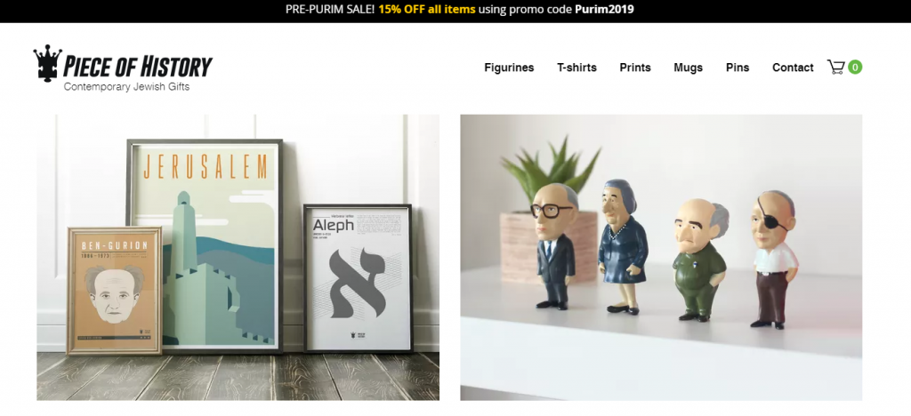
Piece-of-History.com is a Tel-Aviv based company that goes all-out to recreate bits of history using their unique figurines, artwork, t-shirts, and mugs.
Their e-commerce store has beautiful images on every page and allows you to scroll through with their custom ordering feature on the figurines page, using an enhanced shopping feature from Wix.
They have a nicely designed customer service page as well as a t-shirt sizing chart. Both are great at adding value and comfort to your customers when ordering.
Piece-of-History makes it to the list every time it’s about top Wix online store examples .
Related : Best Print On Demand Sites
Whether you want to create your online presence, open a store, start a blog, Wix makes it all easier. Design and build high-quality websites using Wix. What's more, Wix lets you do it for free.
7. A Mood Z
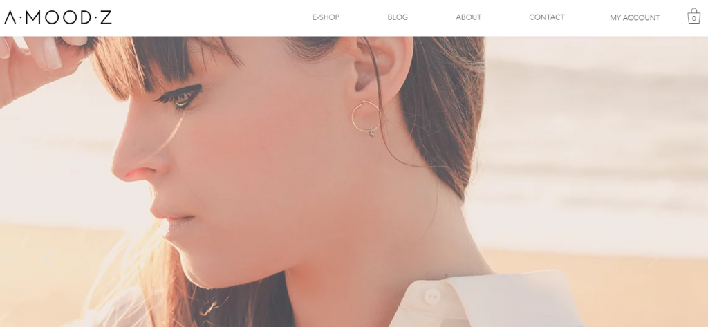
Amoodz.com is a contemporary, beautifully designed website from Wix.
You are instantly drawn to the big, bold pictures of soft, cool, and classic women sporting designer jewelry.
This stunning website makes it easy to navigate with all of the links being directly on top of the first image on the home page.
Even though the site is in French, you don’t have to know how to read it to capture the “mood” they are trying to create in their buyers.
Their about page is simply stunning. It’s nicely laid out with big block images and text to match.
You will notice this site has a blog page, which to me is a must for any good Wix online store today.
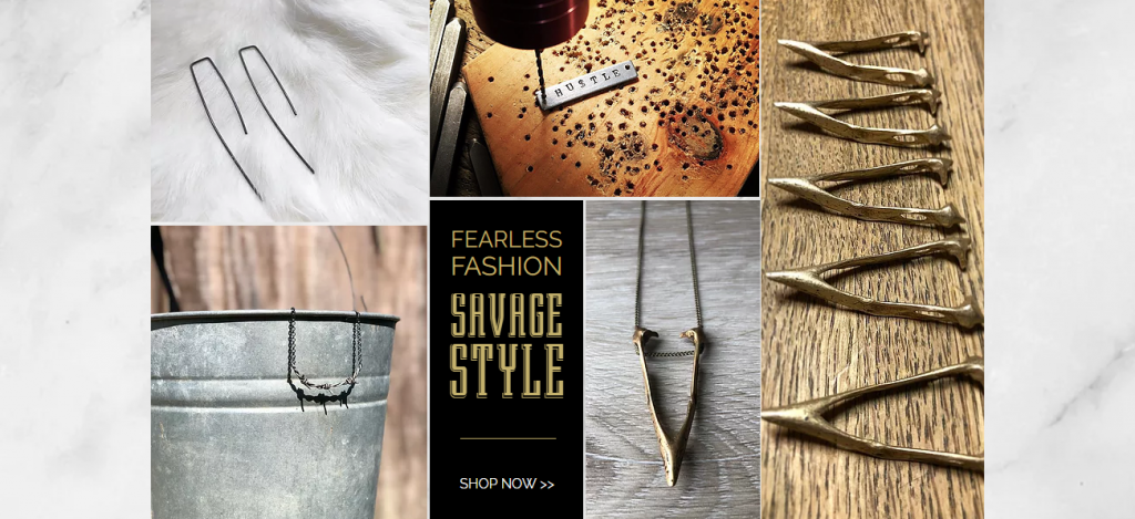
8. Small Change Finery
Next on our count of best Wix shop examples is Small Change Finery.
The Small Change Finery e-commerce site immediately screams class and elegance.
With it’s soft, warm colors, it brings across a jewelry line that is handcrafted in pure excellence.
With beautiful images scattered throughout the home page in a collage-style pattern, you are invited to “shop now” once you are done on their home page.
As you enter the online store, you have the opportunity to get a sampling of their jewelry style.
But the real magic comes when you dive deeper into their navigation pages that drop down from the Shop page.
You can now view their necklaces, bracelets, and earrings by simply using the drop-down menu.
They also have another great example of a customer service page. Beautifully done overall!
Whether you want to create your online presence, open a store, start a blog, Wix makes it all easier. Design and build high-quality websites using Wix. What's more, Wix lets you do it for free.
Conclusion
As you can tell from looking at some of the beautiful websites above, Wix can be used to create stunning masterpieces to sell your products.
Wix for ecommerce is a great choice. You can do virtually anything you want to do with the Wix website.
You Might Want to Read :





![Jungle Scout vs Egrow [Updated Review]](https://mofluid.com/blog/wp-content/uploads/2019/05/junglescout-vs-egrow.png)


