Ecommerce store that struggle with low conversion rates and sales most often than not have bad product pages.
At the same time successful online retailers treat them like their ultimate sales tools and always test new ideas to further increase their revenue.
Product page optimization is almost a must if you have to stay in the ecommerce game.
How To Optimize Product Pages
In this guide we’re going to teach you how to optimize product page of your ecommerce store to increase your conversion.
Related : Best Tools For Your Ecommerce Business
1. Use Exceptional Product Images
67% of consumers say that images are really important when selecting a product.
Clear, High-quality Images
Too many websites try to sell products with low quality images. To maximize your ROI you should use high-quality shots that present your products in the best possible light.
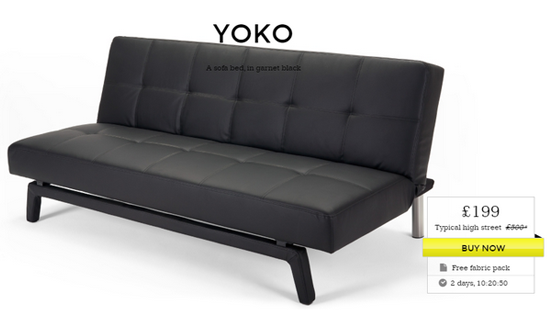
One great ecommerce site with awesome product images is Made.com. See this furniture product page optimization example below. You can simply feel how the furniture stands out from the shot.
Related : Ecommerce Product Image Optimization Examples To Boost Conversions
Clean Background
This allows visitors to focus their attention on the product itself. In most cases, you’d like to use white background for your product focus. But all contrasting colors to your items will work.
You can see how BestBuy uses white background on all of its products.
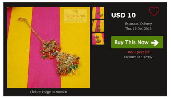
Here’s also a bad example. In the image below you can clearly see how the focus goes to the background, not the product.
That’s why you should avoid using background colors similar to the ones of your products.
Zoom in/out
Your visitors should be able to view all details about your product to be able to make the best decision.
As an addition to providing large images you can also give the option to zoom in and out on photos. This will allow visitors to see things that they otherwise can’t spot.
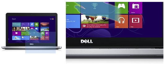
When you place your mouse cursor on the Dell notebook on the Amazon’s website you can see how you get a large zoom in shot right next to the original photo.
Show Products From All Angles
To optimize product page, ensure you show your product from all sides.
One photo is usually not enough to help your visitors make purchasing decision.
They want to be able to view your product from all angles to get the feeling of design and functionality.
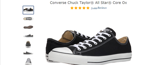
For example: you can see how the Converse Chuck tailor shoes are displayed on Zappos. You have shots from left and right side, the top, the bottom, the front and the back.
Worth Reading : Best Magento UX To UI Tips
Display The Product In Context
Instead of using white background sometimes you can display products in the natural environment they would be used.
This helps people visualize owning and using the products and as a side effect – it boosts conversions.
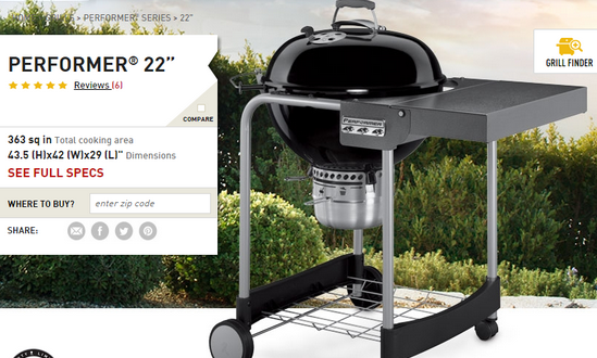
You can see how the grill Performer 22 is shot in nature since it’s most likely to be used outside.
Highlight Features & Benefits With Images
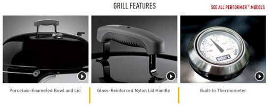
While optimizing product pages, you can use extra images to highlight important features or benefits that your product has. This makes it more believable to your audience (since people believe that they can see).
You present all benefits the way a normal salesperson would do it. Focus on 3 or 4 that matters the most for the specific item.
This is what the previous website is doing with the example of the grill.
Use Models
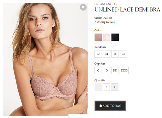
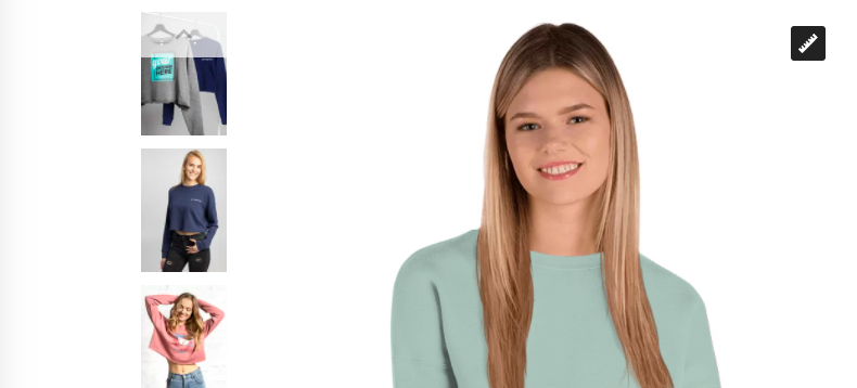
If you’re selling clothes, you might consider using models. They always look better when they’re worn by attractive people.
This also creates the impression that the person will become as attractive if he’s wearing them.
Just think about what Victoria’s secret are doing. They’re hiring one of the best looking women in the world to be able to sell lingerie.
2. Product Descriptions
If you’re thinking how to optimize product pages by playing with product descriptions, let me tell you.
Great copy will help you sell so many products. Most ecommerce sites neglect this part and forget that good product descriptions are important element to winning more customers.
Here are the 3 most important rules to creating awesome product descriptions:
Don’t Use Manufacturer’s Product Description
Many ecommerce sites go the easy way by just copying and pasting the description provided to them from the manufacturers.
This is an extremely bad idea. Here’s why:
- These descriptions are open to be used by all other retailers that sell the same products. If they decide to do so, this will simply create lots of duplicate content that will negative affect your search rankings.
- These descriptions are usually not written in a way to help you optimize your products for search and sell as many items as you can.
Instead, focus the time to rewrite your products descriptions to maximize your ROI. It seems like a lot of work but it’s worth it if you want to grow your business.
If you don’t have the resources to write original descriptions for all your products, then simply do so only for your top selling products.
Useful Post : Ways To Improve Your Ecommerce SEO
Communicate Your Value Proposition
Your product descriptions are not just technical specifications. They are actual sales copy created with the purpose to help you generate more revenue.
Be sure to tap into the main benefits of the product.
What kind of problems that it solve for the user? What are the features? What are the risks?
By giving all the information your visitors need to make a purchasing decision. If you fail to do so, you’ll be missing out of sales you can generate otherwise.
Last but not least, you can experiment with adding stories to your product descriptions.
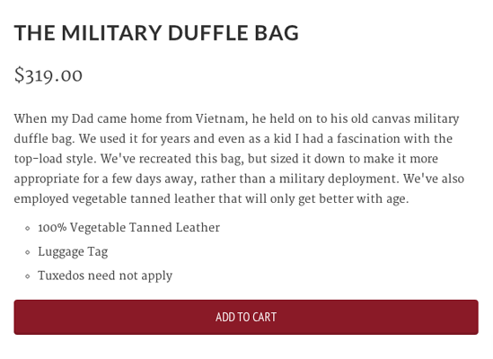
Check out how the website Lemon Stand is selling this bag – by telling a story to convey the benefits. It also triggers your imagination and lets you see how the bag can be used in practice.
Use Power Words
When it comes to selling some words are way more powerful than others. Not just by little bit but by a lot.
Dell was able to increase their revenue with $25 million just by changing 3 words in their copy.
They changed their original call to action – the very common and popular “Learn More” to something more interactive – “Help Me Choose”.
The good news is that marketing experts have already tested and found out which words perform better in a sales copy. This is the ultimate list of power words made by Buffer so feel free to use it.
Explore :
3. Buttons
People need a buy button to make a purchase. The good ones influence more people to take that step and as a result increase conversion and sales.
To create the best buttons for your product page be sure to focus on:
Call-to-action
The text on your buttons is one of the things that you can be sure your visitors read and it highly affect your conversions and sales.
The most common call-to-actions that ecommerce sites use are:
- Buy now
- Add to cart
- Get it
Of course, you can also have secondary call-to-action buttons like:
- Add to favorites
- Add to wish list
It’s important to separate them in some way. Usually the main call-to-action button will use more contracting dominant color and the secondary – more neutral.
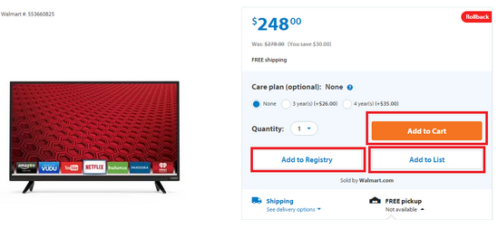
Notice how Walmart has 3 call-to-action buttons:
Color
There are many debates when it comes to which colors are best for your buy buttons. Some might say “green”, others “orange” or “blue”.
The truth is that it all depends on your website design. Since everyone is using different brand identity, the best options for colors might differ.
What’s important is to choose a color which is contrasting and it stands out from your background. You want it to draw the attention of your visitor and to trigger him to take action.
Interesting Read : Ways To Maximize Ecommerce Sales During The Holiday Season
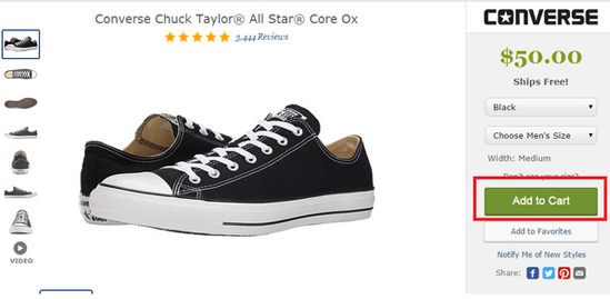
Notice how Zappos uses green Add to Cart button.
It stands out from the grey background and together with the price tag is the only page element with the color.
Position
Keep it above the fold. You don’t want users to miss it and you want to make it as easier as you can for them to buy.
Placing the button just below the pricing or on the same line as your product images makes it really easy to spot.
Online shoppers are used to finding the button in this area. So that way you will make it easier for them to buy.
Supporting Text
this is additional text that convinces around your call-to-action button that convinces your visitors to press it.
You can use it to convey certain benefits and information such as:
- Free shipping (most people don’t expect to pay for shipping)
- Return policies (what if people don’t like the product for some reason. Can they return it? How?)
- Stock availability (Scarcity is a powerful tool that influences sales. People want more something when there is less from it)
- limited offers (people are forced to take action when they know the offer is available only for a limited amount of time)
- testimonials (social proof helps you sell more)
Interesting Post : Creative Ecommerce Content Marketing Examples You’d Want To Steal
4. Customer Ratings and Reviews
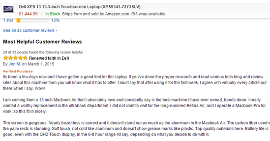
Social proof is one of the factors that greatly affect conversions and sales. The best ways to establish that for your products is to use customer ratings and reviews.
Good reviews and rating will help you build trust with your customers. They will know that other people have bought and tried your products and that they are happy with their experience.
Here’s what you need to do to leverage the power of customer rating and reviews:
Sell Great Products
The only way to generate positive reviews and rating is to sell exceptionally good products. If you lack quality there will be no way to convince people to speak good words about you.
Position Reviews At The Top Of The Page
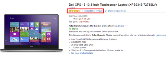
People must be able to see average rating and the number of reviews left for each product on the top of the page.
The best position to display that is below the name of the product. See how Amazon does it.
When people click on customer reviews, they’ll be taken down the page where they can read them.
Call-to-action To Leave A Review
A lot of users leave reviews by their own but you’ll generate far more if you proactively ask people to write one for you.
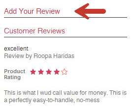
First thing is add “add a review” section on your product page.
The second, send an email with a review request to your customers right after they receive your product.
This is the best possible time simply because people are most excited about their purchase and are most likely to leave a good feedback.
You Might Want To Read : Ecommerce Emails Your Customers Will Love
5. Recommendations
People might not want to buy the current product they’re viewing but this is not a reason for them to leave your site without buying something else.
By adding recommended products to your product page you encourage visitors to review more products which increases the chances for conversion.
Here’s how to use the power recommendations to increase the revenue of your store:
Related : How To Increase Time On Site For Your Ecommerce Store
Recommend Similar Products
Offering irrelevant products won’t serve you any good. You need to display offers that are somehow similar to the current item that person is viewing.
You can show other products that are best sellers in the same category or have the best reviews.
Offer Bundles
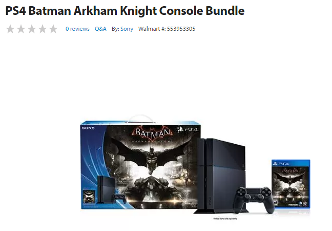
You increase the chance of a sale if you offer bundles of the current product with something else that the customer desires.
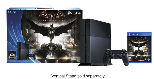
Sony usually offers bundles of PS4 with a video game.
Recommend Addition To The Product
With this option you can easily increase your average sales order. Just think about what people would buy together with the current product that they’re viewing.
If people are browsing a notebook, they’ll probably be also interested into items like:
- a bag
- a mouse
- a fan cooler
Related : Best Magento 2 Extensions To Run Upsell Offers That Convert
6. Exceptional Customer Support
Not so many ecommerce owners consider that good customer support can help them increase conversions and sales.
People need to have answers to all of their questions before to make a purchasing decision. And often your website can’t answer all of them.
This is when they’ll want to contact you and ask you the stuff that matters to them. If they’re unable to do so, most often than not they won’t risk on ordering a product they don’t know everything about.
To give to customer the best possible customer experience be sure to:
Position Phone Number And Chat Box At The Right Place
People don’t need to search to find your phone number. It should be visible in the above the fold area, preferably placed on the top of your page.
Just look at Zappos. They offer 24/7 phone & chat customer support for free.
Call-to-action To Contact & Ask Questions
Proactively ask your visitors to contact your support and ask all the questions that they have about your products.
Why would you want to do that? Because your support team are much more likely to close the sale for you. This also means that you need to prepare them to answer all possible questions about your products.
Worth Reading : Ecommerce Traffic Woes? Resort To These Techniques
In Conclusion
Remember that you can always increase your conversion rates of your ecommerce store. So don’t be afraid to test new changes.
Use this guide as a starting point and build over it with new ideas.
If you want to learn more about how to do on-page optimization for ecommerce, check out our blog posts:

