The more time people spend on your site, the more likely they are to buy something.
If the majority of your visitors leave within seconds of coming to your website, this is a huge indicator that you have a big problem.
Of course, your end goal shouldn’t be to increase your time on site but your conversions and revenue. Still, if people are leaving quickly, there will be no way to turn them into customers.
In this post we’re going to learn and show you as how to increase time on site for your ecommerce store so you have the chance to convert your traffic into revenue.
Related : Best Tools For Ecommerce Business
Optimize Your Traffic For Relevance & User Intent
Every time people click on a link to visit a webpage, they have expectations.
If this is not delivered and it turns out it’s something else, the visitor will simply leave.
Imagine if you expect to see a product page about a specific notebook and instead you are brought to a category page with a list of notebooks.
It’s not what you expected.
You will do much better if you optimize your traffic for relevance and user intent.
Understand What Your Target Customers Want To Find –
Use all methods that you can to dig deeper into what your customer wants to find and need:
- Surveys
- Interviews
- Sales and customer support calls
- Analytics tools – Google Analytics, CrazyEgg, KISSmetrics, etc.
This goes much deeper than just keywords. In fact, 2 searchers might use the exact same keywords but might have totally different needs.
For example: someone who wants to renovate his bathroom will spend a lot of time searching for a plumber, checking out customer reviews, etc.
On the other hand, someone who has a leak in his apartment will want someone who can come within 30 minutes and fix it.
Related : How To Use Google Analytics To Increase Ecommerce Conversion Rates
Target Ultra-specific Keywords –
When you’re doing your keyword research make sure you focus on long-tail keywords that are ultra-specific like specific product models.
In general you should try to optimize first for buy-now rods that include phrases like “buy”, “coupon”, “discount”, “deal” and then for specific products and categories.
Related :
Use Videos
Using videos for your ecommerce website has a lot of benefits – they can help you increase search engine ranking and conversions.
But do you know that videos can help you increase the time people spend on your website as well?
When it comes to text, most people scan and skim pages until they find what they’re looking for (or don’t).
But with video, they interact in a totally different way.
They are more engaged and hooked because the visual information is faster and easier for the brain to process. And once they start watching a video, people would like to finish the whole thing.
The other thing about videos is that they are more time consuming than text and images. People can’t scan and skim, they need to watch the whole thing.
So here’s how to use videos to increase the time on site on your ecommerce store:
Useful Read : Definitive Guide To Ecommerce Content Marketing – Part 1
Use Videos As Call-to-action On Your Homepage –
Here you can use it to communicate your value proposition and engage your audience around your brand.
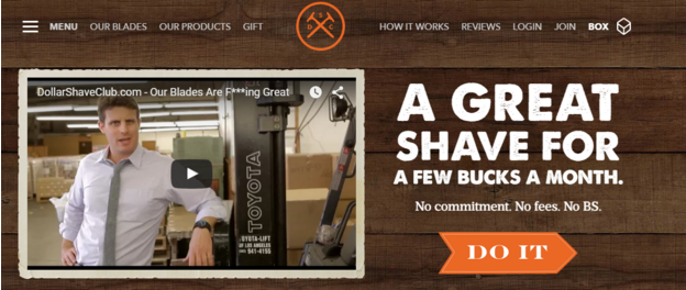
Dollar Shave Club has used this very effectively as a way to hook people and convert them into customers.
Their first video which is still on their homepage went totally viral in 2012 and within 24 hours of launch, the company goto their first 12,000 subscribers.
The reason why it performed so well it was because it was a smart combination of smart positioning, humor and clear call-to-action – subscribe and for $1/month, you get a quality razor straight to your door.
Triggered by this, people started exploring further the website further and got engaged with the content.
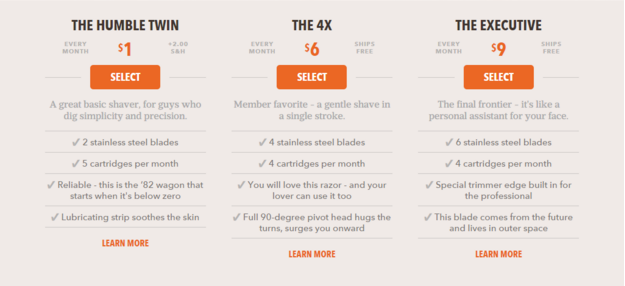
In fact, Dollar Shave club offers only 3 product package options with upsells.
Useful Read : Definitive Guide To Ecommerce Content Marketing – Part 2
Use Videos On Your Product Pages –
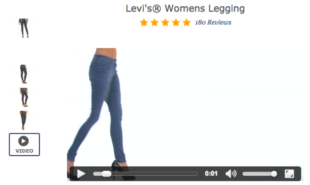
Product videos are perfect for giving more information on how your items work and look like from all angles.
Zappos is famous for using product videos in the last 5 years.
They noticed that product pages with videos have better engagement and usually have 6-30% higher conversion rates than those without.
Related : How To Optimize Product Pages For Higher Conversions
Optimize For Speed
Here’s how loading speed affects visitors’ engagement with your website:
Slow Websites Have A High Bounce Rate –
Loading time is a huge factor that affects the time people spend on your site.
In fact, 40% of the people abandon a website that takes 3 or more seconds to load.
In other words, if you have a slow loading pages, this will make people impatient and will cause them to leave.
It dramatically decreases the time people spend on your site and as a result, you won’t be making much money.
Improving Your Site Speed Results In Increased Time On Site –
Faster website will cause less people to abandon your page and as a result, you will have a higher chance of engaging them with your content.
To improve your site speed:
- Use PageSpeed Insights to identify issues causing your website to load slowly. You’ll get detailed tips on how to improve your site’s performance.
- Optimize the size of your images and all other elements – JavaScript, CSS, etc.
- Use less redirects
- Use Catching
- Use a Content delivery network
Related : Best CDN Providers To Speed Up Your Site
Improve Site’s Navigation
A lot of times, people leave your site simply because they can’t find what they’re looking for.
You can deal with this problem by simply investing the time to improve your site’s navigation.
Create your product categories based on users’ demand – The best way to do that is to ask your customers on what they are currently interested in.
You can do this:
- By making interviews
- By running online surveys
- By using the data that you collect from customer support inquiries
- By using analytic tools like Google Analytics, KISSmetrics, CrazyEgg, etc.
You can also read industry reports and news, check out what your competitors are selling and get insights from your manufactures and distributors.
Arrange Your Product Categories Starting From Most To Least Popular –
Your website visitors are usually scanning your page from left to right, from top to the bottom.
This will allow them to easily find the category they’re looking for and to browse further to subcategories and products.
To find your most popular categories, you can simply use Google Analytics.
You can also use the heatmap tool of CrazyEgg to spot on where people are drawn the most and optimize your navigation menu.
Minimize clicks – Effective web navigation means that the user will be able to get to any page with the least amount of effort.
To do this, you should minimize the number of clicks that each user need to make to get to his desired page.
Consider all the paths that he can take – using your search box, filters, category pages, drop-down menu , etc. and create your architecture in a way that it’s easier to get to the desired product.
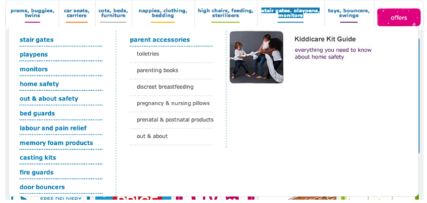
Make your drop-down menus work – They are great for ecommerce sites because they allow the visitor for a review and go to your subcategories and product pages without much hustle.
Related : Best UX To UI Tips For Magento
Don’t overwhelm your audience with too much information. Just include what’s necessary for them to shorten their browsing with 1 step.
Include a smart site search engine
Internal search is extremely important for converting and engaging your website visitors.
This is the main way people find products on your site and they expect it to work well or they might continue their search somewhere else.
This is how to how the internal search to further engage your audience:
Make The Search Bar The Main Focus –
This means that you should put it on the top of your page, preferably in the middle.
You can also highlight it by using contrasting colors and leave an empty space around it so it’s easier for people to spot it.
Include Call-to-action In The Bar –
It’s good if you can include a call-to-action in your bar. Explain them how to use the search by: “Enter keyword or item#”.
Type “search” or “find” in the button with some stylized arrows to drive more action.
Include Auto Complete –
This is a great option that allows visitors to find products faster and easier.
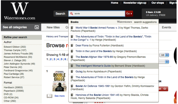
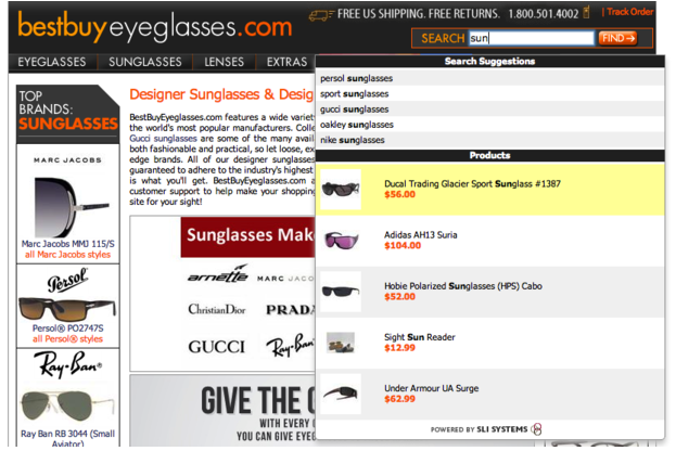
When users start typing a word in the search box, they got a list of suggestions for their term.
You can make your auto-complete even better by including images and pricing for each suggestion so that the visitors can make a better decision on which result suits them best.
You Might Want To Read : Creative Content Marketing Examples You’d Want To Steal
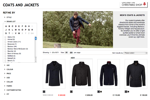
Filter the results page – Sometimes the visitors get a lot in the search results when there are too many products with that name or in the same category.
In this case, you would need to provide users with smart filter options so they can decrease the number of items in their result.
Your filter will depend greatly on the things your customers are looking for and on the products you’re selling.
Worth Reading : Best Ecommerce Product Image Optimization Examples
In general, your customers should be able to filter products based on:
- Pricing
- Brands
- Material made (leather, steel)
- Color
- Size
- Fabric
- Customer rating
- New products
- Products on sale
You should have all the filters that your visitors need to find the products they are looking for but don’t overdo it.
Make sure you take the time to learn what your audience need and create your filtering options around them.
Good internal linking structure
This is the key if you want users to stick to your site.
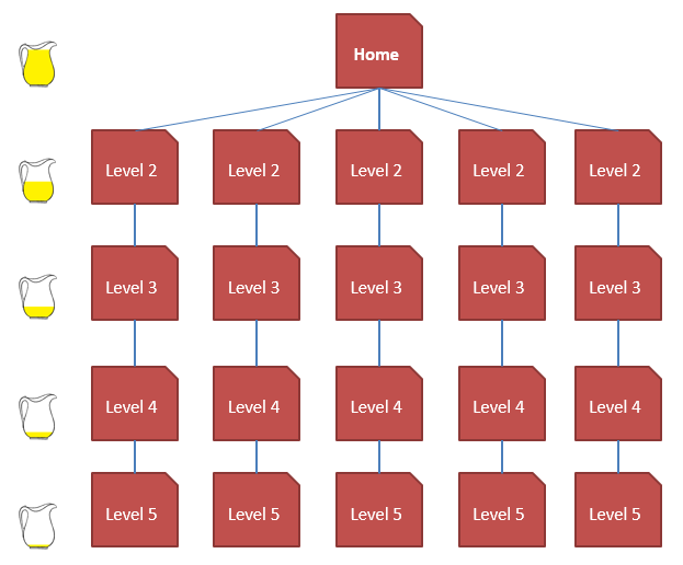
Create Link Equity – You should create a clickable path starting from your homepage through all pages of your website.
It should look like this:
As link equity passes from one page to the next, it is reduced at each level. For that reason, you should build your site in a way that all important pages can be reached within 3 clicks:
Category Page > Sub Category Page > Product
Useful Post : Ecommerce Traffic Woes? – Resort To These Techniques
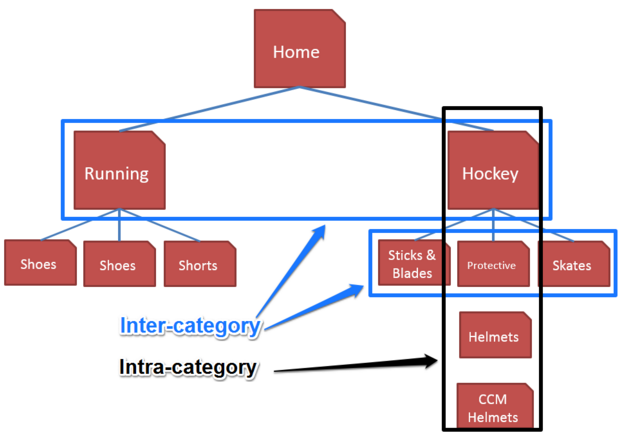
Intra-category Linking (to other categories) –
This is when you create link structures from a category to another category or products from other categories.
For example: you have an electronic store:
Intra-category linking is achieved with the use of:
- Related products
- Recently viewed products
- Top rated products
- Related brands
- Similar categories
- “You might also like”
- “Other people who bought this also bought”
And so on.
Inter-category Linking (to other subcategories or products) –
This is when you link from a category to other subcategories and products within the same category.
Inter-category linking is achieved mostly with:
- The use of the navigation menu
- Product suggestions such as “you might also be interested in”
- Related categories
It is important to create both intra-category and inter-category linking structures to maximize the amount of link equity passed through all your pages.
Leverage On 404 Pages
No matter how hard you try, you will always have broken pages on your site.
Usually when people visit one of those, it is a dead end. They couldn’t find what they were looking for, there is no way to browse further so they would just bounce.
Luckily, things don’t have to be this way and you can make some small modifications to your 404 pages to stick more visitors to your site.
Here’s what you need to do:
Include Site Search –
Tell people that what they’re looking for doesn’t exist any more but they can still use your site search to find products.
By placing a site search box on your 404 page, you’re giving people the option to explore your website further and find products that can fill their needs.
Include related products – you can also include similar products on your 404 page that your visitors can further engage in.with.
This is great when you know which was the initial page they were trying to access and you can offer them something related.
Create a mobile-friendly website
If your ecommerce site is harder to browse from a smartphone, people won’t stick for long.
In fact, 27% of consumers will leave a site if it is not mobile-optimized.
To keep your visitors longer on your site and to potentially convert them, you should develop a mobile-friendly ecommerce site.
This means considering things like:
- Designing your mobile site for the smartphone screen size
- Choosing between responsive vs full-mobile site (the second one provides better experience)
- Creating a mobile navigation and avoiding big menus
- Designing for touch and not clicks
- Simplifying pages and displaying only the most important information
Related : Going Mobile – Mobile Website Vs Mobile App
In Conclusion
In just a few words – to improve your site on site you should focus on creating a website that is easy to navigate and browse. Focus on usability, user’s experience and demand.
Remember: your goal is to increase the time on site so you can engage visitors long enough to convert them into customers. Nothing more.
What is your average time on site for your ecommerce store? Are you currently working on improving that? Let us know in the comments below.

