Back in May, Google announced that mobile searches had overtaken desktop searches in 10 countries, including the US and Japan.
Additionally, Google announced an algorithm update that gives privilege to mobile-friendly websites.
That means it’s now harder to increase your rank for mobile searches (because you need to do more work).
Here at Mofluid, we decided to put together a checklist to help you optimize your ecommerce site for mobile searches and get the traffic you deserve.
Related : How To Optimize Your Mobile App For Google Search
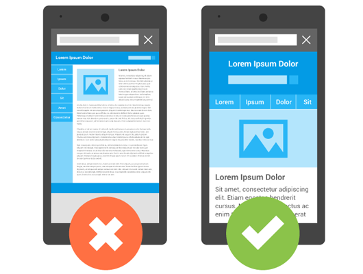
Design For Mobile
When you’re designing your mobile site, you need to pay attention to several things that are very specific to mobile devices:
Small Screen –
One of the main reasons for developing a mobile site is that desktop versions are too big and therefore unusable on a small screen.
Keep in mind the screen size of the most popular devices:
- iPhone 4 (display size 3.5 in, resolution 640 x 960 px, screen size 320 x 480 px)
- iPhone 5 (display size 4 in, resolution 640 x 1136 px, screen size 320 x 568 px)
- iPhone 6 (display size 4.7 in, resolution 750 x 1334 px, screen size 375 x 667 px)
- iPhone 6 Plus (display size 5.5 in, resolution 1080 x 1920 px, screen size 414 x 736 px)
The most common resolutions for Android phones are:
- 320 x 480
- 480 x 800
- 480 x 854
- 540 x 960
- 1280 x 720
- 1920 x 1080
Vertical Screen –
The key different from desktop is that mobile users browse websites while holding the device vertically. At least most of the time.
This means that the above-the-fold area should fit into a narrow screen without leaving out any important messages.
Design For Touch, Not Clicks –
Mobile users use their fingers to navigate when browsing. This means they require bigger buttons that respond to tap or swipe. Hyperlinks are also harder to click on.
Explore : Examples Of A Great Mobile App Design
Create Mobile Versions Of All Pages –
To provide a full mobile experience, you need to create mobile versions of all pages on your site.
You don’t want users to be browsing and then suddenly be redirected to a desktop page. This will make users want to leave your site, thus killing your conversion rates.
Call-to-action Button Above The Fold –
Don’t make users scroll left and right on the screen to find the buy button. List the call-to-action in the above-the-fold area and make it easy to spot.
Don’t Forget About Desktop –
Google gives preferences to websites that are optimized for both desktop and mobile. So, even if the majority of your visitors browse using smartphones, don’t forget that SEO is about optimization for all devices.
Related :
Choose A Mobile Configuration
There are 3 options for creating a user-friendly mobile website:
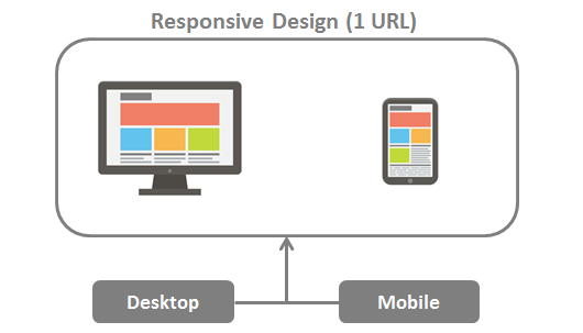
Responsive Design –
With this option, you serve the same HTML code on the same URL regardless of the user’s device. However, you have the option of rendering the display differently based on the screen size.
Responsive design is very quick and easy to create because it does not require much development effort. The only drawback is that it decreases loading time because the mobile user will be downloading the entire site.
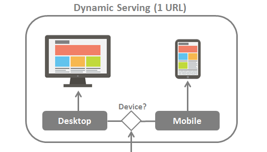
Dynamic Serving –
With this option, you load a different HTML file on the same URL depending on the device used to load the page. That way, you can create entirely different versions for your desktop and mobile sites.
This configuration requires more work to develop, implement and manage because you’ll need to create an entirely different version for each type of device used to access your site.
The benefit of this setup is that the dynamic service will decrease the loading time for mobile users.
Explore : Best Ecommerce Mobile Apps
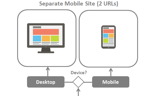
Separate URLs –
With this option, you serve a different HTML file depending on the device, thus redirecting users to a different URL.
This is the hardest mobile configuration to manage. You need to make sure that your mobile and desktop versions redirect appropriately, which could be hard to do.
Signal Your Configuration To Search Engines
Once you choose your mobile configuration, it is extremely important to signal that to search engines. Otherwise, they might not be able to read it properly, which can negatively affect your search engine rankings.
Here’s how to do it for the different type of configurations:
Responsive Design –
To signal to browsers that you are using a responsive design configuration, you need to add the following meta tag to your document:
<meta name=”viewport” content=”width=device-width, initial-scale=1.0″>
The metaview tag gives instructions on how to adjust the dimensions and scaling of the page to the width of the device. When this information is missing, mobile browsers render the page at a desktop screen width.
The other thing that this achieves is that it increases the font size and scales the content to fit the screen. This makes it easier for users to read and interact with different pages.
Related :
Additionally, you can make your images responsive by including the element.
Dynamic Serving –
Here, you need to send a hit to Googlebot for smartphones so that it will crawl your page and discover the mobile version of your site.
This is the hit you can send with the Vary HTTP header:
GET /page-1 HTTP/1.1
Host: www.example.com
(…rest of HTTP request headers…)
HTTP/1.1 200 OK
Content-Type: text/html
Vary: User-Agent
Content-Length: 5710
(… rest of HTTP response headers…)
This tells the browser that the loading content will differ depending on the user agent that requests the page.
In case you’re already using the Vary HTTP header, simply add “User-agent” to the list that is already being served.
Separate URLs –
The most common setup is to redirect the desktop URL, such as www.example.com, to a mobile versions, such as m.example.com, for anyone accessing the site from a smartphone.
To help Google better understand these separate mobile URLs, you should add the following annotations:
– On the desktop page, add a special link to a rel=”alternate” tag pointing to the corresponding mobile URL. This allows Googlebot to find the location of the mobile URL.
<link rel=”alternate” media=”only screen and (max-width: 640px)”
href=”http://m.example.com/page-1″ >
– On the mobile page, add a link to a rel=”canonical” tag pointing to the desktop URL.
<link rel=”canonical” href=”http://www.example.com/page-1″ >
Related :
Make Your Content Crawlable
When it comes to mobile sites, it is super important that you:
Allow Googlebot To Access Javascript, CSS And Image Files –
To be able to render all pages properly, you should always allow Googlebot to read the JavaScript, CSS, and image files used by your website.
If your robot.txt prohibits crawling for these assets, Google will not be able to properly render and index your content.
Explore : How To Increase Your Mobile Commerce App Downloads
Avoid Unplayable Content
Smartphones can’t access and read content the same way desktop computers do.
It’s important that you understand the limitations of different platforms so your users won’t get upset when they are unable to read something.
Avoid Flash Videos –
Flash is not supported by the majority of mobile devices, such as the iPhone.
When users visit a page with an unplayable flash video, they will see an error message similar to this one:
This provides a poor user experience and makes your visitors frustrated and unhappy.
Use HTML5 Videos Instead –
The solution is simply to use the HTML5 standard tag to ensure that videos and animations can be successfully loaded on mobile devices.
You can easily use Google Web Designer to create these animations in HTML5.
That way, if you run a media website, for example, you can simply create all your animated banners with HTML5 to ensure they will be viewed on all devices.
Interesting Read : Setting Up Google Analytics For Your Mobile App
Fix Redirect Issues
These issues happen very frequently when ecommerce owners choose to use the separate URL configuration.
This issue doesn’t occur with dynamic serving and responsive design because, in these cases, you’re not using redirects.
To avoid this problem, you should:
Avoid URL Redirects –
Every URL redirect you use slows down your site, and that negatively affects your search engine rankings. That’s why you should avoid or at least minimize the use of this tool.
There are some cases when you can’t avoid URL redirects, such as:
- Redirecting to the mobile website for a smartphone user
- Redirecting from the mobile URL to the desktop one for a PC user
Also Read : How To Use Admob To Promote Your Mobile App
Avoid Redirecting To The Wrong URL –
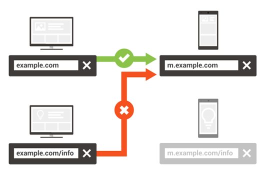
Make sure you always redirect the user to the appropriate mobile URL.
One common mistake is to redirect mobile users from a desktop URL to the mobile homepage, regardless of which page was initially requested.
This also happens when the desktop URL has been generated dynamically and the parameters don’t map well to the equivalent mobile URL.
Another issue might be that your desktop site redirects some mobile devices, but misses others.
To avoid these issues, you should:
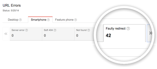
- Use Google Search Console to detect problems. It will automatically send you messages when faulty redirects are detected. You can see them in the Smartphone section, under the name Faulty Redirect.
- Set up your server so that it redirects mobile users to the right URL.
- If a page doesn’t have a mobile version, keep the user on the desktop page instead of redirecting them to the mobile homepage.
- Use responsive design to serve the same content to mobile and desktop visitors.
Decrease Page Load Time
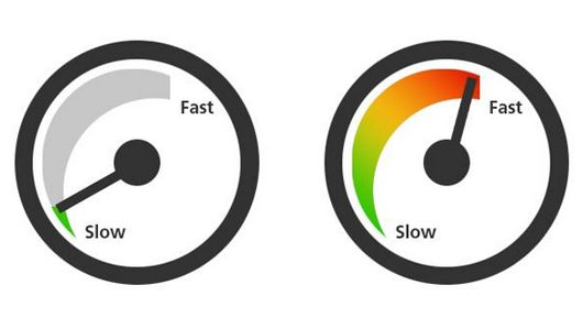
Site speed is a huge factor that affects search engine rankings.
Since most smartphone use 3G networks to load and access web content, site speed has become an even more important factor for creating a great user experience.
Load times also hugely affect conversion rates – some studies have shown a 7% drop in conversions for each 1 second of delay.
Here’s how to ensure a fast load time for your mobile users:
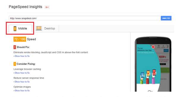
Use PageSpeed Insights To Find Issues –
This tool will allow you to automatically detect issues that are slowing down your site.
Go to PageSpeed Insights, put your URL in the box, and click on Analyze.
When the analysis is complete, click on Mobile to view the results.
You’ll get a score from 1 to 100 depending on how well your website is optimized for mobile.
Your recommendations will be listed in:
- Should fix – your highest priority issues for fixing
- Consider fixing – less important issues for fixing
You’ll also see which rules you have already passed.
The most common issues that you’ll face are:
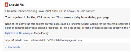
- Blocking JavaScript and CSS resources
- Not using browse caching
- Forgetting to optimize images
- Forgetting to compress resources
- Minifying HTML and Javascript
You can expand on each issue by clicking on Show How to Fix. By doing that, Google PageSpeed Insights will give you suggestions on how to fix the problem.
Related : Best CDN Providers To Speed Up Your Site
Optimize Your Images –
Image file size is a huge factor that affects loading time.
A 2 MB picture will take much more time to download than a 25KB one. Multiply this by the number of images you have on your page, and you’ll see the difference.
The first thing that affects the size of an image is the file type.
The 3 most common file types you should be using are: JPEG, GIF and PNG. Don’t use RAW or TIF files because they’re not compatible for the web.
Related : Ecommerce Product Image Optimization Examples To Boost Conversions
Ideally, ecommerce sites should use image files that are smaller than 70 KB. If your current images are larger than that, you’ll need to resize them.
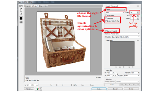
To do that, you can simply use Adobe Photoshop.
Open your image, find the Menu, and go to File → Save for Web.
Choose either JPEG, GIF or PNG as your file format, adjust the quality and choose the color options.
Be sure to check the size of the image after you have saved it.
Related : How To Optimize Your Product Pages For Higher Conversions
What To Do Next
Optimizing your ecommerce site for mobile is just the beginning. It requires additional SEO efforts that are totally worth it.
With time, you’ll see how your mobile search traffic will start to increase, as well as your revenue.
Be sure to frequently check how well your mobile site is performing. As you make changes, add new products and create new pages, you might end up provoking new issues that you’ll need to fix.
If you want to take it to the next level, you might want to create a mobile app for your ecommerce site.
You can easily create one in a just a few minutes with Mofluid and upload it on the app store.
What are your current issues with your mobile site? What do you need to work on to increase your mobile search traffic? Let us know in the comments section below.

