Mobile is the new king of ecommerce. Last holiday season, almost 30% of purchases were made from mobile devices.
If you look at your Google Analytics account, you’ll be able to see how many of your website visitors enter using mobile devices.
By looking at the data, you can tell if your mobile site is performing well.
Do you see a high bounce rate, and lower numbers for page views, conversions and sales from mobile users? If the answer is yes, then it’s time to improve your site to make your visitors happy.
To create a mobile-friendly ecommerce site, follow these steps:
Related : Ways To Maximise Ecommerce Sales During Holiday Season
Design For Mobile Displays
You can’t create a great mobile-friendly design for your ecommerce store if you’re not familiar with the specifics of mobile display.
Here are a few things you need to know:
Different Smartphone Sizes –
Different smartphones have different screen sizes. Usually, they vary between 320 px to 400 px across (although old iPhone models measure just 240 px).
Tablets are 480 px to 800 px across when held like a book, and 1280 px across when held like a television.
In other words, there are number of screen types, ranging from from 320 px to 1280 px. So, how do you create a design that fits perfectly on all these different screens?
The truth is, you don’t need to. You can simply focus on the most popular devices your visitors use to browse your site.
Related : Going Mobile – Mobile Website Vs Mobile App
Use Google Analytics To Prioritize Devices –
Did you know that you can use Google Analytics to find out which devices people are using to browse your site?
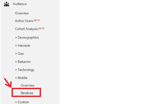
To do this, simply go to Google Analytics and click on Audience -> Mobile -> Devices:
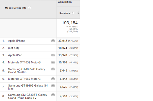
Then, you’ll see a list of the most popular devices and the traffic generated from each one.
In this case, the most popular device is the iPhone, followed by the iPad.
Related :
- How To Use Google Analytics To Increase Ecommerce Conversions
- Ultimate Guide To Setting Up Google Analytics For Your Mobile App
Separate Mobile Site
Having a mobile-friendly ecommerce site also means creating an entirely separate site for your mobile users.
Here’s how to do that:
Provide Mobile Users With Different HTML –
A different website means that you’ll need to load an entirely new HTML, not just a different CSS as you would with a responsive website.
Host On A Subdomain Or Subfolder –
Your mobile site must be hosted on a subdomain, like m.domain.com, or a subfolder, like domain.com/mobile, to be able to load its different pages.
There is also a third option – using the same URL, but with dynamic serving so it will be able to load the new HTML.
If you choose to use different URLs, always remember to keep them parallel (www.domain.com/first-page and m.domain.com/first-page).
Explore : Best Progressive Web Apps
SiteSpeed
Loading speed is important for all websites, but it’s even more crucial for mobile ones.
When people are browsing from their smartphones, they’re often using their 3G connection, which loads pages slower than Wi-Fi.
You also need to consider the fact that the processing power of smartphones is slower than that of most desktop computers.
Therefore, you should focusing on optimizing your mobile site so that it will load faster.
Here’s how to do it:
Related : Best CDN Providers To Speed Up Your Site
Use PageSpeed Insights To Find Issues On Your Mobile Site –
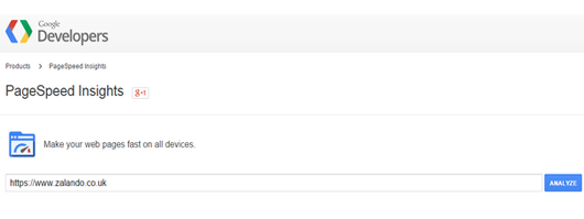
The best way to learn how to further optimize your mobile ecommerce site is to use Google’s PageSpeed Insights tool.
Simply type in your URL and click on “Analyze.”
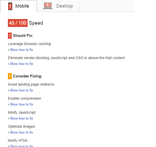
Here’s an example with Zalando.co.uk.
In the “Mobile” tab, you will see a list of issues on the website, ranked from most important to least pressing.
PageSpeed Insights will even show you how to fix each issue; access this feature by clicking on “Show how to fix.”
Related : Ways To Improve Your Ecommerce SEO
Replace Images With CSS3 –
Images take a long time to load, and having too many of them on the page will slow down your website.
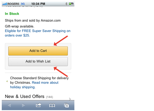
To speed up your site, you can simply ditch some of the images and replace them with CSS3 files. Buttons and other UI elements can be built entirely on CSS3.
Look at the mobile buttons on Amazon.com. Pure CSS; no images.
For images that you can’t remove, try combining them with CSS Sprites.
Split Content Among Multiple Pages –
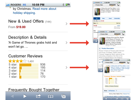
Keep your core content on your main page and link all details to separate pages to speed up your mobile site.
Going back to the Amazon example, they have placed all further information about new and used offers, description & details, and customer reviews are on separate pages.
This eliminates HTTP requests for 3 images and reduces the HTML file size to 45 KB.
Worth Reading : Ecommerce Product Image Optimization Examples To Boost Conversions
Keep Redirects To A Minimum –
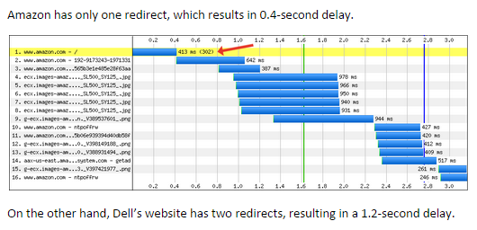
Each additional redirect will make your website slower, especially on mobile devices.
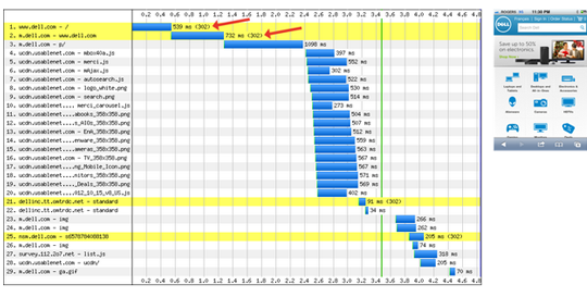
Amazon has only one redirect, which results in 0.4-second delay.
On the other hand, Dell’s website has two redirects, resulting in a 1.2-second delay.
Every time the browser receives a redirect, it has to process it locally, then send the new URL back to the server, again. All of this happens over a cellular network with varying speeds, meaning it can slow things down. A lot.
Be Congruent With Your Desktop Site
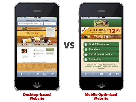
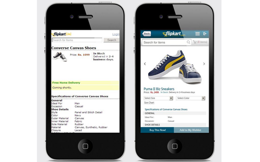
In their desire to make a website mobile-friendly, developers often forget that they should make the mobile version feel and look like the desktop site.
You don’t want users to wonder if they are browsing the same site, or make them angry because they are not able to access some of your content.
To make your mobile site congruent with your desktop site, be sure to:
Use The Same Branding –
Your mobile site should have your logo and it must use the same main colors. The design must look similar to the desktop site, but with a more minimalist feel.
When the user looks at the mobile version, they should think, “It feels and looks exactly like the desktop site, but all the content fits on the screen.”
Keep The Same Main Functionality –
Don’t make your mobile visitors mad because they can’t access certain functionality or pages from your site just because they’re browsing from a small screen.
Make sure you allow them to:
- use your site’s search engine
- browse through product categories
- visit the shopping cart
- read information about shipping, delivery, returns
- access your contact information
Use analytic tools like Google Analytics, CrazyEgg and KISSmetrics to learn how your mobile users are using your site; this will allow you to learn which functionalities are most important to them.
Mobile Navigation
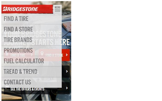
Unfortunately, desktop navigation doesn’t really work for mobile. Most menus are too big and don’t fit on smaller screens.
That’s why you should always follow these tips:
Avoid Large Menus –
This takes too much time and is a lot of trouble for the user. Instead, you should focus on creating a navigation menu suited for mobile.
Worth Reading : Ecommerce Traffic Woes? Resort To These Techniques
Use The 3-line Method –
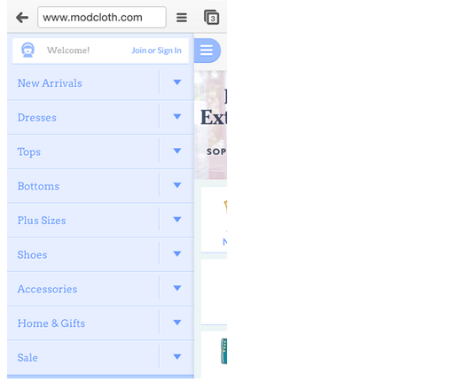
This is a great option for mobile-friendly navigation. In fact, it is used by companies like Facebook, ModCloth & New York Times.
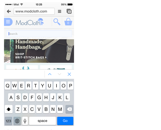
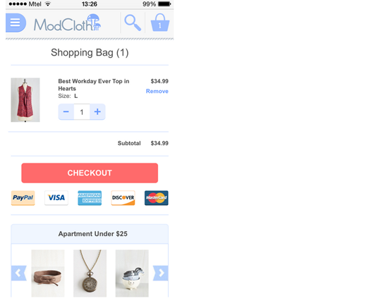
If you look at the ModClouth navigation menu, you’ll see it actually has 4 lines:
When you tap on 1, you open up the main navigation menu, designed especially for mobile and vertical screens.
When you tap on 2, you go back to the homepage.
When you tap on 3, you open up the search bar.
And when you tap on 4, you go to your shopping cart
Design For Touch, Not Clicks
When people are browsing from a smartphone, they don’t have a mouse. This means that they cannot use options such as left and right clicks.
In fact, people are not clicking at all. Instead, they’re swiping and tapping with their fingers, which totally changes the game.
To create a mobile-friendly design, you should design it for touch, not clicks.
Here’s how to do that:
Give Enough Space For Fingers –
Fingers are not as precise as mouse cursors. They take up more space on the screen. That’s why mobile users usually need more space for browsing.
Make sure you always have a space measuring 28 x 28 px around links to make sure that people can tap on those links.
Also, while you can constantly track the movement of a mouse cursor, with touch screens, you don’t know what your users are doing until they touch the screen.
Related : Best Magento UX to UI Tips
Give Feedback When The Screen Is Touched –
Have some signal that shows your users when a button has been touched. Oftentimes, users are not aware of whether they have actually activated a button because of a slow connection.
This causes them to click a second time when the page is already loading.
Fix this problem by showing a button indent or highlighting a linked box.
Use Buttons –
Visitors must understand where they need to click to go to the next step. From mobile devices, there are no “hoverable” areas to indicate which areas are clickable, so you must make this clear.
The best way to do that is simply to use buttons to define where users can tap and swipe to activate a link or action.
Redesign Drop-down Menus –
They still work on mobile, but you’d need to redesign them a bit. On desktop versions, the activation of a drop-down menu usually occurs when the user hovers over it, but since you can’t do that on mobile, you need to change it to touch-activated.
The menu should also show a clear separation between options.
Minimize Text Input –
Typing is slower and harder on mobile. To make your site mobile-friendly, minimize the text that people need to fill in. Be sure to remember their shipping address and credit card details.
You also need to remember that their virtual keyboard will take up half the screen. You’ll help your visitors a lot by splitting your forms up between multiple pages that only take up the top half of the screen.
Use Mobile-specific Features –
Your mobile site gives you additional opportunities which you should take advantage of by adding extra features. For example: you can add click-to-call on your mobile number and turn your address in map link.
Simplify Product Pages
Once people reach a product they’re interested in, they’re just a step away from a purchase. A good product page will encourage the user to buy now, whereas a bad one will push them away.
That’s why product pages are one of the most important pages for any ecommerce site.
They are even more important when it comes to mobile versions, where there are more opportunities to screw up and push the customer away.
To create a mobile-friendly ecommerce product page:
Related : How To Optimize Product Pages For Higher Conversions
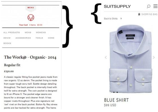
Use A Thin Header –
The header is the top section of the page responsible for brand identity and navigation. If you make it too wide, it will take up too much space on the screen (which is not necessary).
Compare the headers for these two websites.
Notice how the website on the right has minimized the header by using icons instead of a text menu.
Prioritize Your Call-to-action –
We know that the call-to-action on desktop websites should always be above the fold. But did you know that the same is true for mobile, as well?
However, when redesigning the mobile experience, people often forget to put the call to action on the the first screen. You should also make it visible enough so that it draws the visitor’s attention.
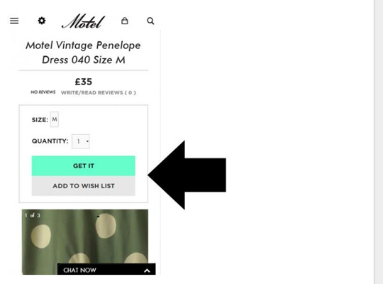
To illustrate how to position the call-to-action on a mobile site, we’ll show you the example of Motel, a women’s fashion site.
In the desktop version, you can see how the site places the call-to-action “GET IT” above the product description.
In the mobile version, you can see how the call-to-action “GET IT,” previously located on the right side of the page, is moved to the top of the page because of the small screen.
Simplify Checkout
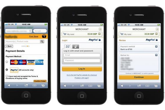
Bad mobile check out will kill your sales. To maximize every possible dollar, you should invest some extra time into simplifying this part of the process and making it as user-friendly as possible.
To do that:
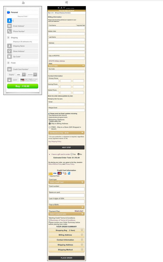
Include Only Vital Fields –
Only ask the user to fill out the information you need to complete the sale. Nothing else.
Don’t ask questions such as: “How did you hear about us?” or “Would you recommend us to your friends?”.
Also, be sure to save all data from previous purchases so that the user won’t have to type it out again. This includes: name, email address, credit card details, address, etc.
Consider the difference between these two check-out options. Which one do you think is easier to fill out?
Related : Tips To Improve Magento Checkout Process
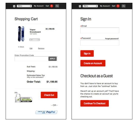
Allow Users To Checkout As A Guest –
Users are much less likely to complete an order if they have to create an account.
This is even harder on mobile – you need to create a username and password, fill out the details, go to your email to confirm your account, etc. I’d rather skip all this and not buy the product.
That’s why you should allow users to check out as a guest.
In Conclusion
Creating a mobile-friendly ecommerce site is all about user experience. Understand how people use your site from their smartphones and make it easier for them to buy from you.
Related : Is Your Business Ready For Mobile Commerce?
To read more about the starter guide to mobile usability testing click here


